Healthcare
Life Expectancy by Region (1950-2050F)
![]() See this visualization first on the Voronoi app.
See this visualization first on the Voronoi app.
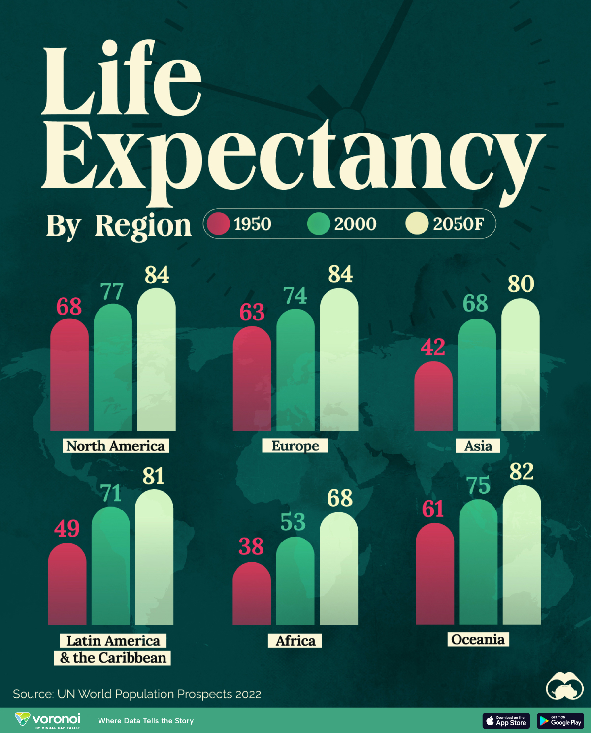
Mapped: Life Expectancy by Region (1950-2050F)
This was originally posted on our Voronoi app. Download the app for free on iOS or Android and discover incredible data-driven charts from a variety of trusted sources.
Average life expectancy at birth is projected to surpass 80 years in most global regions by 2050, according to the UN World Population Prospects 2022.
This infographic illustrates the trajectory of life expectancy at birth for both sexes, comparing data from 1950 and 2000 with the organization’s projections for the year 2050.
Life Expectancy to See Substantial Growth
At the beginning of the 19th century, no country had a life expectancy exceeding 40 years, with much of the global population enduring extreme poverty, limited access to medical care, and a lack of sanitation.
By 1950, newborns in Europe, North America, Oceania, Japan, and parts of South America were seeing life expectancies surpassing 60 years, while in other regions, newborns could only anticipate a lifespan of around 30 years.
For instance, individuals in Norway had a life expectancy of 72 years, while in Mali, it was merely 26 years. On average, Africa had a life expectancy of only 38 years.
Since then, life expectancies have substantially grown worldwide. Notably, between 1950 and 2000, significant progress was observed in Asia and Latin America and the Caribbean.
| Region | 1950 | 2000 | 2050F |
|---|---|---|---|
| North America | 68 | 77 | 84 |
| Latin America & the Caribbean | 49 | 71 | 81 |
| Europe | 63 | 74 | 84 |
| Asia | 42 | 68 | 80 |
| Africa | 38 | 53 | 68 |
| Australia & Oceania | 61 | 75 | 82 |
The improvement in life expectancy can be attributed to various factors such as advancements in medical technology, better healthcare infrastructure, improved sanitation, access to clean water, and increased awareness about health and nutrition.
In Perspective With History
Although today it seems like rising life expectancy is a given, for much of history it’s worth noting that the situation was much more static.
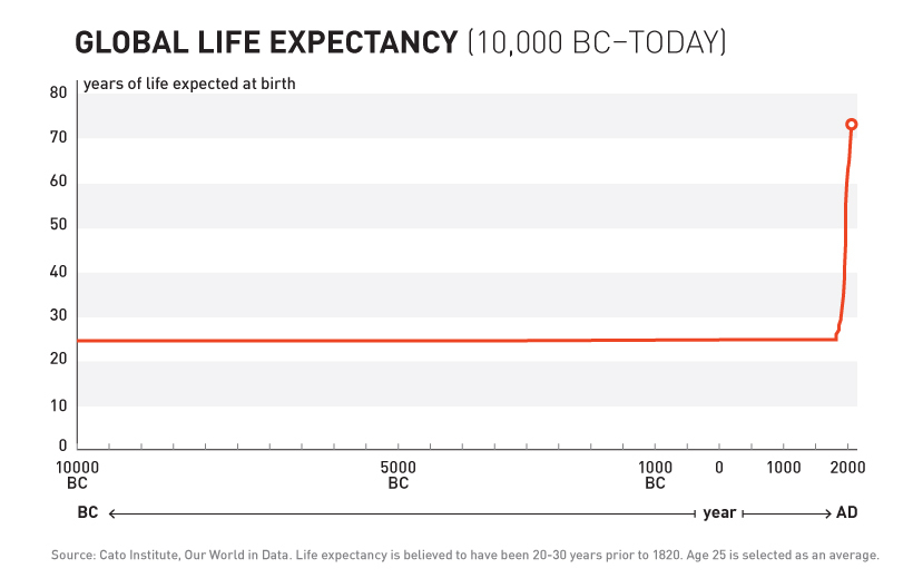
As shown in the above chart, for most of human history life expectancy at birth actually sat in the 20-30 year range. It’s only since the mid-19th century that the aforementioned improvements (sanitation, clean water, etc.) allowed for the exponential and regular progress we see today.


Healthcare
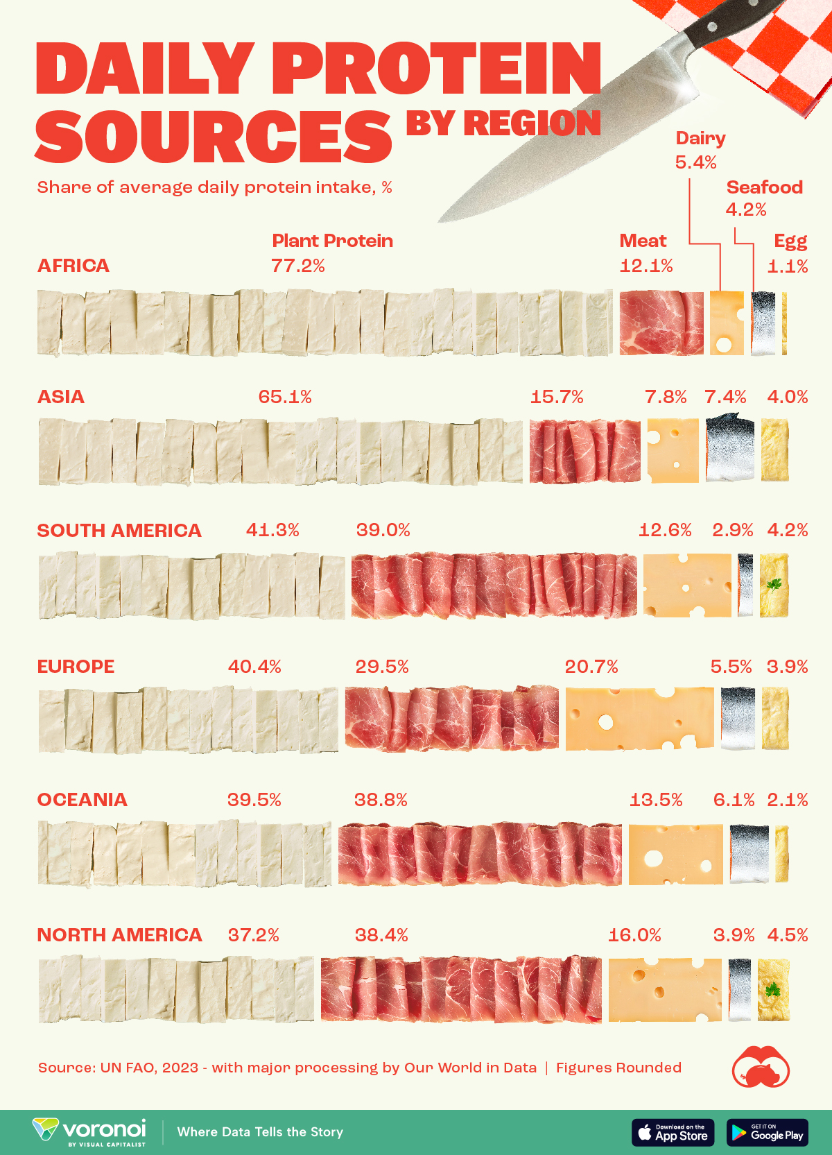
Visualizing Daily Protein Sources by Region
Here, we break down how people around the world get their protein intake.
Visualizing Daily Protein Sources by Region
This was originally posted on our Voronoi app. Download the app for free on iOS or Android and discover incredible data-driven charts from a variety of trusted sources.
Protein plays a vital role in creating and maintaining every cell in our bodies.
This graphic breaks down how people in different regions of the world get their protein intake. The figures come from the UN Food and Agriculture Organization (UN FAO), accessed via Our World in Data.
The figures we present here reflect the distribution of daily protein intake across regions, with each region’s total adding up to 100%. It’s important to note that this is distinct from the actual amount of protein consumed per person, often measured in grams.
Developed Countries Have More Access to Meat and Dairy
Protein has many benefits for our bodies. It is a building block of bones, muscles, cartilage, and skin. Our hair and nails are comprised mostly of protein. It is also used to repair tissue, oxygenate the body, and make enzymes, which aid in digesting food.
People in more developed regions (like North America or Europe) get a larger share of their daily protein from meat and dairy.
| Region | Plant protein (%) | Meat (%) | Dairy (%) | Seafood (%) | Eggs (%) |
|---|---|---|---|---|---|
| Africa | 77.2 | 12.1 | 5.4 | 4.2 | 1.1 |
| Asia | 65.1 | 15.7 | 7.8 | 7.4 | 4.0 |
| South America | 41.3 | 39.0 | 12.6 | 2.9 | 4.2 |
| Europe | 40.4 | 29.5 | 20.7 | 5.5 | 3.9 |
| Oceania | 39.5 | 38.8 | 13.5 | 6.1 | 2.1 |
| North America | 37.2 | 38.4 | 16.0 | 3.9 | 4.5 |
When only considering meat, South America, with big producers like Brazil and Argentina, takes the lead as the most important protein source.
Meanwhile, Asia, with top fish producers China and India, leads in protein intake from seafood.
In Africa, where many developing countries in the world are located, plant protein is the most important protein source for the population.

-
 Healthcare1 week ago
Visualizing Daily Protein Sources by Region
-
 Globalization2 weeks ago
Mapped: The Top Exports in Asian Countries
-
 Finance2 weeks ago
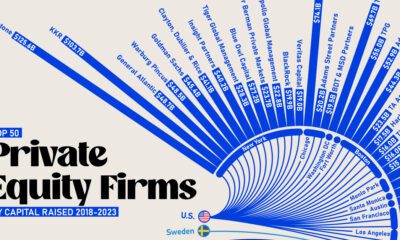
Ranked: The World’s 50 Largest Private Equity Firms
-
 United States2 weeks ago
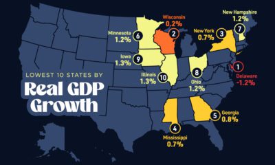
Mapped: The 10 U.S. States With the Lowest Real GDP Growth
-
 United States2 weeks ago
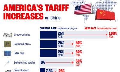
Comparing New and Current U.S. Tariffs on Chinese Imports
-
 China2 weeks ago
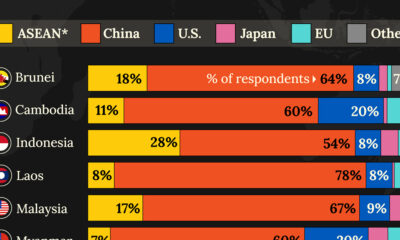
Which Countries Have the Most Economic Influence in Southeast Asia?
-
 Demographics2 weeks ago
The Top 25 Nationalities of U.S. Immigrants
-

 Countries2 weeks ago
Ranked: Countries Where Youth are the Most Unhappy, Relative to Older Generations