Misc
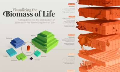
Visualizing the Biomass of All the World’s Mammals


Visualizing the Biomass of All the World’s Mammals
Even as we understand more about the world we live in, certain aspects of it remain undefined or hard to comprehend.
One such example is in the scale and distribution of Earth’s life. What’s the ratio of wild to domesticated animals? How much do all of the world’s humans weigh?
Until recently, such questions were nearly unanswerable. A new report titled The Global Biomass of Wild Mammals helps shed more light on the composition and scale of life on our planet. The research provides an estimate of the biomass of all mammals, globally—including humans.
So, What is Biomass Anyway?
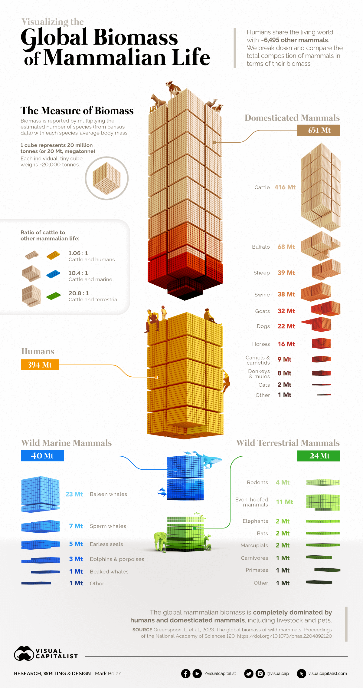
Biomass is simply the weight of living things.
In this study, researchers
created rough estimates for four major categories of mammals: humans, domesticated animals, and those that were found in wild terrestrial and marine environments. A further breakdown of mammal groups are found within each category.
To achieve this, they took the estimated number of species from census data and multiplied it with each species’ average body mass.
One component worth pointing out is that animals contribute very different amounts to the world’s biomass total. For example, whales significantly outweigh rodents in terms of biomass, even though there are fewer species and populations of whales. The fact that whales are so much larger than rodents means that even smaller populations can contribute a meaningful portion to overall biomass.
Mammalian Biomass, Organized Neatly
Each larger cube above represents 20 million metric tons of carbon, and the entirety of the visualization represents all living mammalian life on Earth.
The paper separates mammals into four distinct categories:
| Category | Total Mass (Mt) | Top Sub-Category |
|---|---|---|
| Domesticated Mammals | 651 | Cattle (416 Mt) |
| Humans | 394 | n/a |
| Wild Marine Mammals | 40 | Baleen Whales (23 Mt) |
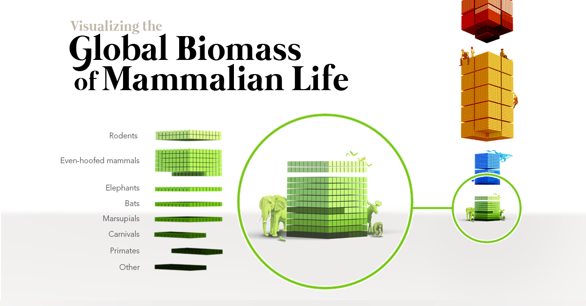
| Wild Terrestrial Mammals | 24 | Even-Hoofed Mammals (11 Mt) |
| Total | 1,109 |
One of the most obvious takeaways from this data is that humans make up one-third of total mammalian biomass.
Perhaps even more strikingly, the animals we’ve domesticated for food, companionship, and labor make up close to 60% of the total weight of Earth’s mammals. Domesticated dogs and cats alone equal the total weight of all other wild land mammals combined.
The world’s sheep, on their own, weigh as much as all the whales and seals in the ocean. Domesticated buffalo such as the water buffalo, a species commonly found in Asia, combine to have the third largest biomass of all mammals.
Finally, there’s one category of mammal that comes way out on top.
Cattle Planet
The global livestock population has risen along with the human population, and cattle are now the top mammal in the world by weight.
In fact, just the United States’ share of cattle matches the biomass of all wild mammals on Earth.
As the standard of living continues to rise for people around the world, beef consumption has been increasing in many developing countries. Of course, raising cattle is a resource and land intensive operation, and there have been very real impacts on a global scale. For one, cows are a major source of methane emissions. As well, in Brazil, which accounts for around 25% of the world’s cattle population, pasture has directly replaced large swaths of rainforest habitat.
Waning Wildlife
At the very bottom of the visualization, dwarfed by humans and domesticated mammals, lies the vast array of wild mammals that live on planet Earth.
It’s sobering to see that the biomass of North America’s human population alone compares closely with that of all terrestrial wild mammals in the world. This includes plentiful creatures like rats and mice, as well as large mammals like elephants and bears.
Below are the top 10 wild mammalian contributors to biomass in the natural world.
| Rank | Contributor | Total Mass (Mt) | Individuals (millions) |
|---|---|---|---|
| #1 | Fin Whales | 8 | 0.1 |
| #2 | Sperm Whales | 7 | 0.4 |
| #3 | Humpback Whales | 4 | 0.1 |
| #4T | Antarctic Minke Whales | 3 | 0.5 |
| #4T | Blue Whales | 3 | 0.05 |
| #6 | White-Tailed Deer | 2.7 | 45 |
| #7 | Crabeater Seals | 2.0 | 10 |
| #8 | Wild Boar | 1.9 | 30 |
| #9T | African Elephants | 1.3 | 0.5 |
| #9T | Bryde's Whales | 1.3 | 0.1 |
In the ocean, whales and seals are the heavyweight champions. On land, deer, and boar come out on top as they are both heavy and plentiful.
Humans have a complicated relationship with large mammals. We feel a very clear connection to these creatures, and they are often the key figures in conservation efforts. That said, even small populations of humans have wiped out large mammal species in the past.
The news that cattle outweigh wild land animals by a factor of 20:1 is a reminder that human influence is perhaps even more powerful than we think.
The more we’re exposed to nature’s full splendor […] the more we might be tempted to imagine that nature is an endless and inexhaustible resource. In reality, the weight of all remaining wild land mammals is less than 10% of humanity’s combined weight. – Ron Milo, Professor of Systems Biology
Source: The global biomass of wild mammals
Data notes: To come up with the numbers above, scientists estimated the total biomass of wild mammals on Earth by manually collecting population estimates for 392 land mammal species, which make up about 6% of all wild land mammal species, and using machine learning to infer the global populations of the remaining 94%. Their estimate includes 4,805 wild land mammal species out of approximately 6,400 known and extant wild land mammal species, excluding low-abundance species for which data are scarce.


Healthcare
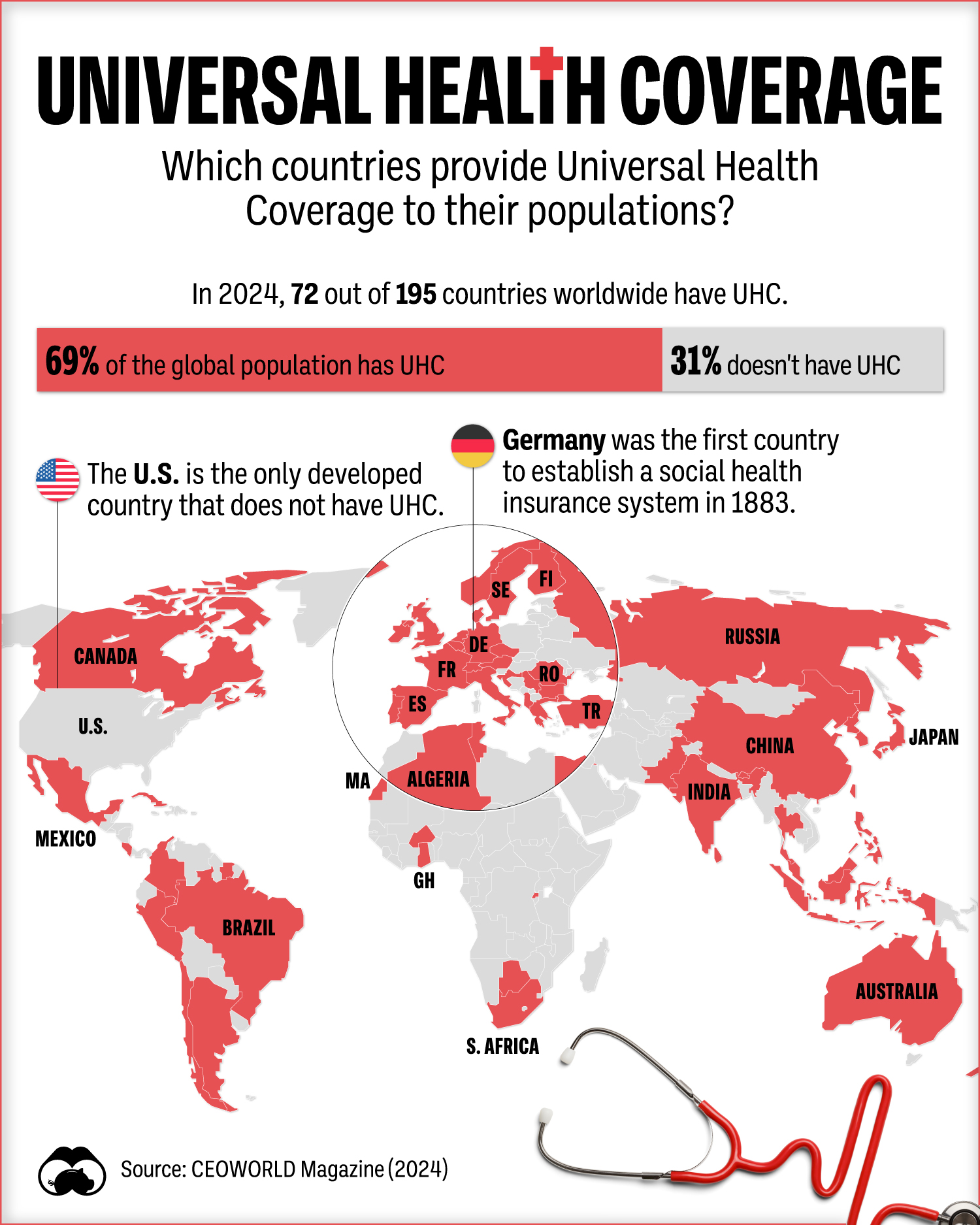
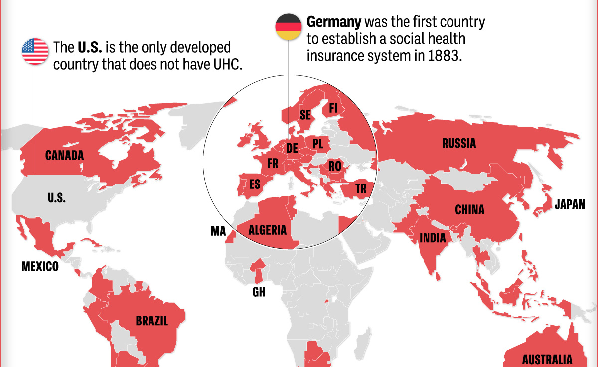
Which Countries Have Universal Health Coverage?
Most of the world population has universal health coverage (UHC). This map shows which countries do and don’t provide public health coverage.
Which Countries Have Universal Health Coverage?
This was originally posted on our Voronoi app. Download the app for free on iOS or Android and discover incredible data-driven charts from a variety of trusted sources.
According to the World Health Organization (WHO), Universal Health Coverage (UHC) means that everyone has access to a full range of health services—from emergency interventions to palliative care—without financial difficulty.
In this graphic, we use data from CEOWorld Magazine to visualize the countries that have UHC versus those that do not, along with how UHC coverage breaks down in terms of the global population.
The State of Universal Health Coverage in the World
In 2024, 73 of the 195 countries worldwide had UHC, resulting in around 69% of the world’s population having some form of universal healthcare.
| Country | UHC? |
|---|---|
| Albania 🇦🇱 | Yes |
| Algeria 🇩🇿 | Yes |
| Argentina 🇦🇷 | Yes |
| Australia 🇦🇺 | Yes |
| Austria 🇦🇹 | Yes |
| Bahamas 🇧🇸 | Yes |
| Belgium 🇧🇪 | Yes |
| Bhutan 🇧🇹 | Yes |
| Botswana 🇧🇼 | Yes |
| Brazil 🇧🇷 | Yes |
| Bulgaria 🇧🇬 | Yes |
| Burkina Faso 🇧🇫 | Yes |
| Canada 🇨🇦 | Yes |
| Chile 🇨🇱 | Yes |
| China 🇨🇳 | Yes |
| Colombia 🇨🇴 | Yes |
| Costa Rica 🇨🇷 | Yes |
| Croatia 🇭🇷 | Yes |
| Cuba 🇨🇺 | Yes |
| Czech Republic 🇨🇿 | Yes |
| Denmark 🇩🇰 | Yes |
| Egypt 🇪🇬 | Yes |
| Finland 🇫🇮 | Yes |
| France 🇫🇷 | Yes |
| Georgia 🇬🇪 | Yes |
| Germany 🇩🇪 | Yes |
| Ghana 🇬🇭 | Yes |
| Greece 🇬🇷 | Yes |
| Hong Kong 🇭🇰 | Yes |
| Iceland 🇮🇸 | Yes |
| India 🇮🇳 | Yes |
| Indonesia 🇮🇩 | Yes |
| Ireland 🇮🇪 | Yes |
| Israel 🇮🇱 | Yes |
| Italy 🇮🇹 | Yes |
| Japan 🇯🇵 | Yes |
| Kuwait 🇰🇼 | Yes |
| Liechtenstein 🇱🇮 | Yes |
| Luxembourg 🇱🇺 | Yes |
| Macau 🇲🇴 | Yes |
| Malaysia 🇲🇾 | Yes |
| Maldives 🇲🇻 | Yes |
| Mauritius 🇲🇺 | Yes |
| Mexico 🇲🇽 | Yes |
| Morocco 🇲🇦 | Yes |
| Netherlands 🇳🇱 | Yes |
| New Zealand 🇳🇿 | Yes |
| North Korea 🇰🇵 | Yes |
| Norway 🇳🇴 | Yes |
| Pakistan 🇵🇰 | Yes |
| Peru 🇵🇪 | Yes |
| Philippines 🇵🇭 | Yes |
| Poland 🇵🇱 | Yes |
| Portugal 🇵🇹 | Yes |
| Romania 🇷🇴 | Yes |
| Russia 🇷🇺 | Yes |
| Rwanda 🇷🇼 | Yes |
| Serbia 🇷🇸 | Yes |
| Seychelles 🇸🇨 | Yes |
| Singapore 🇸🇬 | Yes |
| South Africa 🇿🇦 | Yes |
| South Korea 🇰🇷 | Yes |
| Spain 🇪🇸 | Yes |
| Sri Lanka 🇱🇰 | Yes |
| Suriname 🇸🇷 | Yes |
| Sweden 🇸🇪 | Yes |
| Switzerland 🇨🇭 | Yes |
| Taiwan 🇹🇼 | Yes |
| Thailand 🇹🇭 | Yes |
| Trinidad and Tobago 🇹🇹 | Yes |
| Tunisia 🇹🇳 | Yes |
| Turkey 🇹🇷 | Yes |
| United Kingdom 🇬🇧 | Yes |
The United States is the only developed country without health coverage for all of its citizens.
As of 2022, the Census Bureau estimated that only 36.1% of Americans were covered by public health insurance. Private health insurance covered 65.6% of the population. This along with other facts has led the U.S. having the world’s highest healthcare spending figure per capita.
The History of Public Health Coverage
Germany was the first country to establish a social health insurance system. Launched in 1883, the program began by covering only blue-collar workers, then slowly expanded its net of those covered.
The first international declaration underlying the need for adequate health care was the Declaration of Alma-Ata in 1978 at the International Conference on Primary Health Care in 1978. The conference’s target was to achieve global UHC by 2000.
The Ottawa Charter for Health Promotion of 1986 also reiterated the “Health for All by the year 2000” goal, ultimately paving the way for more countries to adopt UHC.

-

 Cryptocurrency6 days ago
Visualizing the 15 Most Valuable Bitcoin Addresses
-

 Crime2 weeks ago
Visualizing the Companies Online Scammers Impersonate the Most
-

 Markets2 weeks ago
Comparing Saudi Aramco’s $1.9T Valuation to Its Rivals
-
 Mining2 weeks ago
Visualizing Cobalt Production by Country in 2023
-
 War2 weeks ago
Mapped: The World’s Largest Armies in 2024
-
 Demographics1 week ago
Charted: America’s Most Popular Baby Names in 2023
-
 Technology1 week ago
Visualizing the Top Countries, by Mobile Data Usage
-

 Misc1 week ago
Ranked: Top 10 Deadliest Animals for Humans