Inelegant variation
These graphs are from the (US) National Cable & Telecommunications Association (the cable guys)
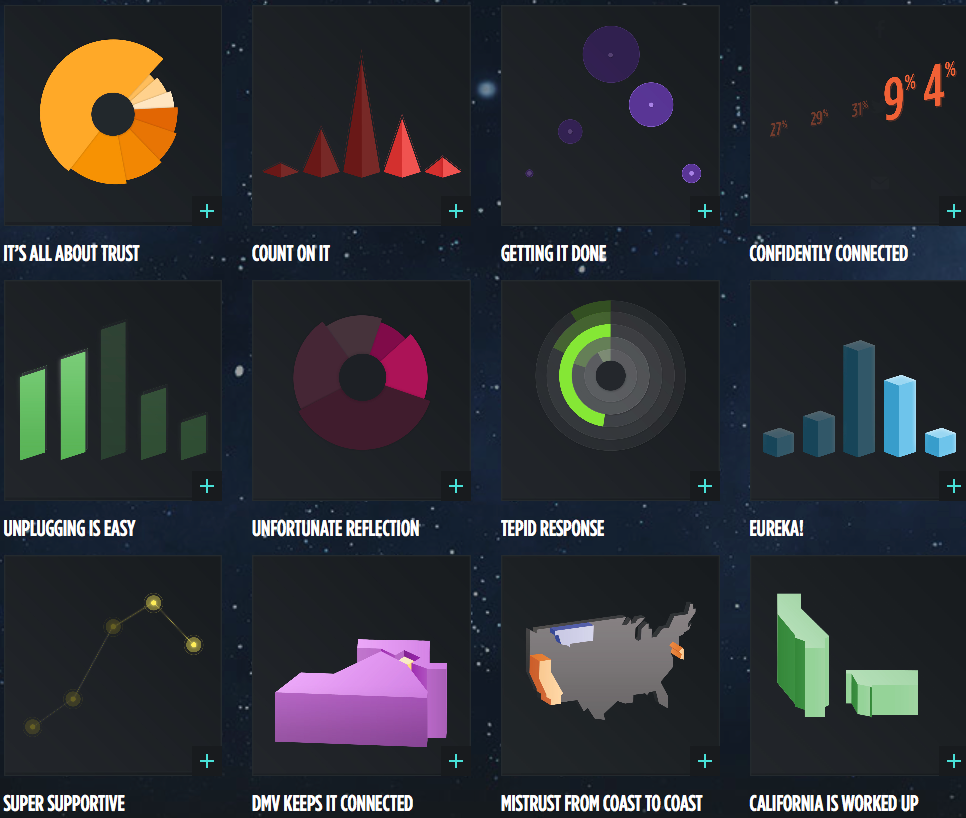
Apart from the first graph, they are based on five-point agree-disagree scales, and show the many ways you can make pie and bar charts more interesting, especially if you don’t care much about the data. I think my favourites are the bendy green barchart-orbiting-a-black-hole and the green rectangles, where the bars disagree with the printed numbers.
Since it’s a bogus poll, using the results basically to generate artwork is probably the right approach.
Thomas Lumley (@tslumley) is Professor of Biostatistics at the University of Auckland. His research interests include semiparametric models, survey sampling, statistical computing, foundations of statistics, and whatever methodological problems his medical collaborators come up with. He also blogs at Biased and Inefficient See all posts by Thomas Lumley »