
This exercise involved making a linocut in a variety of colours.
Key words from the brief:
- A design which uses three different colours and three separate blocks of lino
- Experiment with drawing a design, using a thick black marker pen to outline and block in any large dark areas such as shadows
-
Registering the paper using a simple jig
- Editioning
Approach
A reflection on personal voice
I received my tutor feedback part way through the Single colour linocut exercise. The point that really got me thinking was:
“Think about your personal voice and what you are trying to say in your work and what you want to make work about”.
This seemed pretty fundamental.
I had some vague ill formed ideas about what personal voice means but needed a much better understanding.
I read a helpful OCA blog titled Personal Voice that defines ‘personal voice’. The key points I took from the blog and related discussion thread:
- It means making the work about something that’s personally driven, other than technique or formal qualities.
- It’s about finding your themes through reflecting on the work one’s making in a way that looks at meaning rather than colour palette, composition, line and mark making, etc.
- I think this is the question one has to pose when evaluating one’s work….Is it asking questions of the audience, are they being asked to explain the work to themselves or are they being momentarily visually entertained without being challenged.
This reminds me of a podcast called Out on the Wire: Storytelling secrets of the new masters of radio by Jessica Abel. The series of podcasts explores how to generate, structure and test new ideas that are compelling and engage an audience.
One of the producers (Ira Glass), interviewed in episode one gives some advice to anyone looking to find and develop an engaging idea. She advised that you should:
“Pay attention to what you pay attention to”
I think this pretty much sums up where I feel I am in developing my own personal voice. I’m starting to pay attention to what I find interesting or unusual. I know what I like and what feels ‘right’ or genuine, and I know what feels forced or phoney.
So with this context in mind, I can explain my approach to my multi block linoprint.
Research & design
The design for the multi-block built on learnings from the previous two exercises:
- Composition and layout from Test Cut 3 in the first exercise where the lino was divided into 5 cm squares that formed the basis of the layout
- The church/graveyard subject from my second print in exercise 2
For my subject I choose a church in the village where my parents live in Castle Rising, Norfolk; This church and the surrounding area has a particular resonance with me.
I spent a Sunday afternoon wandering around the churchyard taking reference photographs of any features or textures that caught my eye. I was thinking of the kinds of images and textures that would work in the context of the grid layout.


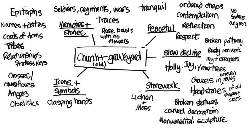
Graveyards seem to be a recurring theme for me and I’ve used different churchyards or cemeteries for three or four exercises. I created a mindmap to draw out themes, ideas and areas of interest.
I wanted to create an interesting image with different snapshots and snippets of information organised using a square grid layout. What I liked about Test Cut 3 was how I noticed myself reading the image and extracting meaning from the comparison and relationship between one image and another.
I used some of the photographic reference to draw and paint a couple of images to see if this sparked any ideas.


I was also interested to explore a way of designing and planning a mutli-colour block print and struck on the idea of using layers in Photoshop to help define each colour block very precisely. This is a technique that I’ve used numerous times for creating and colouring illustrations.
I started by quickly sketching up a test image using a 5 x 5 square grid layout and reference materials from the photo shoot.
I scanned this into Photoshop, applied a scaled grid and adjusted the underlying image to create a scaled image that I could work on top of on a lightbox.


The next refinement was created on a lightbox. Note that the bottom left panel was replaced at this point because I didn’t feel it was strong enough and didn’t really work in the context of the overall image.


A final refinement was made to the image using a lightbox and ink pen. I scanned this into Photoshop, cleaned up and enhanced the contrast of the black ink and created different layers for each set of colour ‘flats’.
I made a final adjustments to the layout at this point:
- Replacing the crucifix on the top of the church spire with a weather vane – I don’t know how I made this mistake on the first version of the line art.
- Swapping out the close up of the headstone with something more intricate and interesting.


Creating the lino blocks
I reversed the images and then output each layer in black and white. Each black and white image became the line art for each of the three blocks.


After watching various helpful youtube videos I made a registration device that I can reuse for future projects (see how this was used in the printing section below).
I then transferred the reversed image onto the first block by carefully marking up and registering the first line art against one of the hardboard mounted lino blocks and then tracing the image using carbon paper.


This worked really well. I traced over the carbon copy with permanent marker pen before starting the cut.
I repeated the process for the other two blocks. The only variation was for the third and final block where more care was needed to get an accurate tracing.


Printing
I wanted a ten-print edition so started with a premise that I’d probably lose a third of the prints due to wastage.
I printed half on 150gsm Snowdon Cartridge paper and the rest on 250gsm Fabriano Una (50% cotton). The initial print run was 17 prints, and each block took about 5-hours to complete.
I changed inks for this edition of prints, and started using Intaglio Traditional Relief Ink which comes premixed with extender and drying agent.
Process
I did all of the printing at home using the registration device. The following images show the step-by-step registration process.


This approach gave excellent and hassle-free registration and made that part of the process quick and clean.
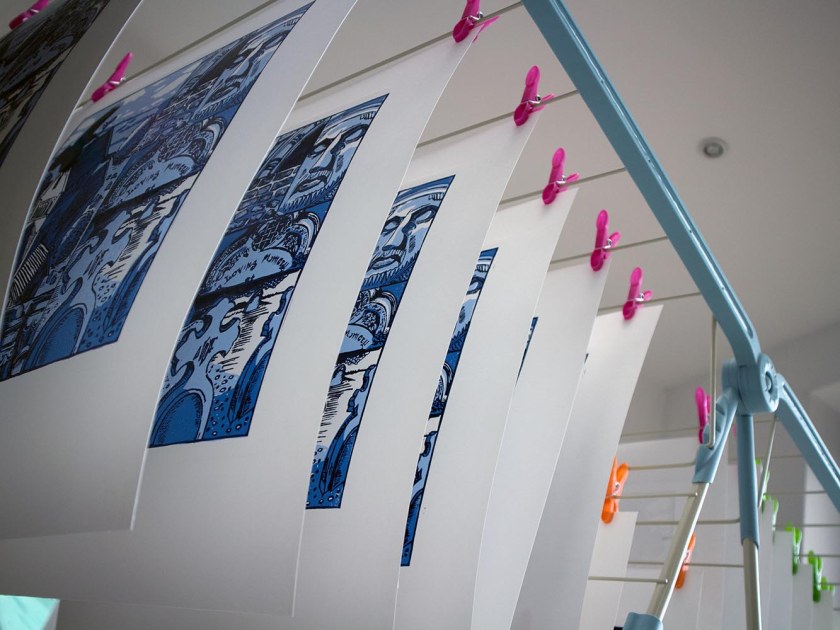
I bought a stand alone clothes hanger to peg up the prints as they were printed.
Until I attempted this multi block print I hadn’t appreciated that there is a real art to getting the printing right. There are so many variables to consider:
- Mixing enough ink to cover the whole print run and getting the right colour mix
- Not over or under inking the block
- Applying ink to all areas of the block. This was particularly challenging with small areas of ink surrounded by large cut areas
- Keeping the cut areas clean and ink free
- Applying the right pressure in the right places. I used a plastic baren to start and a wooden spoon in specific areas
The process required a patient and focused mindset. Unlike the black and white single block prints I created in the last exercise which were printed on a press and so were relatively quick to print, this print run was done manually, which took a lot more time and a surprising amount of physical effort.
The final print…
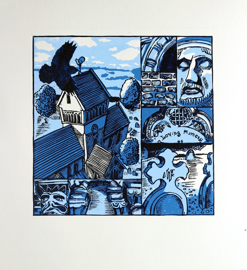
I ended up with a final edition of ten-prints which was my goal.
Research
Look at the work of Edward Bawden, and his son, contemporary printmaker Richard Bawden. Take a close look at the way they have worked with multiple blocks. What can you learn from them?
Edward Bawden
Edward Bawden’s lino prints tend to be organised in blocks of colour e.g.
- Pier Front – Blue sky (background), Black pier with white of the paper (mid ground), turquoise for the sea (mid ground), black beach (foreground) and yellow spot colour highlights.
- Borough Market – Grey sky and church (background), black bridge arches, green and three browns for the market interior.
- The colour blocks pretty much speak for themselves i.e. limited overprinting of colours
- Limited use of back as an outline
Blocks of colour really are blocks that distinctly distinguish different areas of the picture
Colour and image hierarchy are clearer
The use of black and white seem strengthened and are used to add texture, pattern and detail. These blocks tend to be central.
Richard Bawden
Richard Bawden has a similar approach to his father with very distinct areas of colour within the image.
He does use overprinting to add a final line art layer to call out detail and this is generally overlaid on top of simple solid blocks of colour.
Lessons from Edward and Richard Bawden
- Keep colour block shapes simple.
- Use them to create image hierarchy.
- Don’t be afraid to be bold in making decisions i.e. keeping some areas/elements completely black and white, and use this for emphasis.
- Allow colour areas to speak for themselves; no need to have a black outline across all areas of the image.
Reflection
What went well
- I think the process of creating inked line art scanned into Photoshop to create separate layers for each colour block worked well for this type of design.
- The registration device made registering each block really simple and easy, and kept the printing process clean and tidy.
- The ideas generation and design probably took about 5% of the overall time. This meant that the ‘creative’ bit of the process was mostly restricted to the start of the process. I think the final block is where there was the best combination of technique and inventiveness; fine and accurate cutting combined with creative mark making and interpretation.
- Some of the mark making and textures work well. I’d like to really push and exploit this is future prints.
- I think the size and complexity of the was quite ambitious and I’m please with the execution and final result.
What would I differently/better
- In terms of developing or expressing a personal voice, I’m not sure how much this image is an expression of what I want to say. That’s because I haven’t figured that out yet. It’s definitely using an approach and stye that I’ve developed over the last year and I’m comfortable with; boiling down ideas into pen and ink line art, and then using a combination of digital and analogue media, techniques and processes to create a final image.
- I wish I’d done the research at the start of the exercise. I didn’t really exploit the potential of using areas of single colour as stand alone components within the print. My instinct is to use a final line art layer to the frame the image, and Edward and Richard Bawden clearly show this is not necessary.
- I think there is a balance I haven’t quite got right yet between planning the image and process up-front whilst still allowing creativity and inventiveness and the ability to exploit the strengths of the medium.
