The Devil is in the Details

31 01 2015

The red boxes show where the subsequent details are on the painting “Burrard Crossing”. The painting is pretty big; 28 by 45 inches so there is a lot going on up close.

detail_areas

Starting from the largest areas and moving in to the smallest details, here is the left (South) abutment of Burrard Bridge:

abutment_left

Two views of the water reflecting the “Up-lights” that illuminate the piers under the bridge. In the earlier stages of the painting there were no lights on the Southern pier. I went to investigate and found that the lights had burned out and haven’t been repaired for some time. I went back to the studio and painted them in as I imagined them to be when lit. (See my post about Artistic License).

reflections_right

There is a great deal of painting in the small space under the Bridge :

under_the_bridge

The setting sun is lighting up the windows in a West End apartment building near Stanley Park and the tops of the masts also catch its last, dying rays.

reflected_sunset

And even closer everything is bathed in a warm light:

tree_shadows

I enjoyed painting the ‘little eyes’ of the car headlights peering out of the gloom.

trees_lit_up

running_lights

I just discovered, while talking with one of the captains of these small, aquatic vessels, that the navigation lights on theses boats aren’t visible from behind. I had to paint the mysterious green glow of these lights in any case. Viridian Green glazed over one of those blobs of white I talked about earlier. The surrounding space is tempered with the same green hue.

Speaking of artistic license, the boat that is about to leave the dock on the far side is actually the same boat that is pulling away from us. I liked the idea of the back and forth urgency of these little craft. This one is in competition with itself. There is, in reality, only one boat at a time that does this run.

I can’t leave out the North Abutment of the bridge:

distant_abutment

Last, but not least, the few brushstrokes that shows the lights at the South end of the bridge ready to light up the sky in the Sun’s absence:

lights_in_sky

Next time I’ll show how I stretched the painting and applied a retouch varnish.


Water, Water, Everywhere

23 01 2015

Coming down to the ‘short strokes’ as a friend of mine once put it. There are a lot of short strokes when painting water.

water

And, you guessed it. I’m painting wet in wet; highlighting the crests of waves as they pass behind the Water Bus and in front of the reflections of the bridge’s abutment.

film

We shot some video of this part of the painting. I think it would make a good demonstration on what to watch for when painting reflections on water.

watersofar

Here is the painting with the water, at this stage, half completed.

The next posts will deal with stretching the painting and polishing off the details.


‘Lighting up’ Burrard Crossing

1 01 2015

Missed blogging last week with all the holiday festivities. Hope everyone had a great time.

I was busy lighting up Burrard Crossing with thick dabs of colour for all the highest highlights.

lighting1

lighting2

lighting3

When they are dry these little blobs of white will be glazed with colour so they are both light and bright and the final varnish will make them sparkle.

lighting4

At this stage there was still work to be done on the water and the Aquabus in the foreground. Next post I will show how I have darkened the water in the foreground to add mystery and unite the bus with the foreground.


Building Up Lights and Brighter Colours: Burrard Crossing.

9 12 2014

The third week of this composition and the sky, mountains and bridge abutments are all but completed. I am adding the streetlights and running lights on the water bus. This part of the composition is most rewarding; when all of the values are correct, the lights and colours start to sing.

burrardxsing

Next week the water will be finished and I can begin refining the final details of the bridge and boats.

I am proudly wearing part of my Nephew’s new line of sports clothing: Montem Valebat.


Burrard Crossing. The First Application of Colour.

28 11 2014

I’m now laying in the colour; breaking areas into warms and cools and adding some areas of local colour to the painting of the Burrard Bridge. You may notice that, at this stage, the painting can still be made lighter and more intense. As you can also see, the weather here can be quite moody at times.

burrard_crossing_colour

The next step, which I will post in about a week, is to build up the the lights and brighter areas of the composition while I refine the drawing.


Burrard Crossing large

21 11 2014

When I painted a small version of this scene (see my post entitled Diptych) I felt there was so much more I wanted to describe in the composition. I decided to recompose the subject a bit bigger this time. Here is my progress on the monochromatic underpainting so far:

Burrard Crossing

Burrard Crossing

What I enjoy most about large scale canvasses is how you feel a part of the scene.

The next step will be the addition of colour over the grisaille. I’ll keep you posted.


Bowen Island Redux

12 11 2014

bowen_island_redux_smFrom time to time I will revisit a subject I really enjoyed painting but, like many artists, I can’t bear to redo the same painting, twice, in exactly the same way.

In this version I stretched out the composition in a panorama and moved Bowen Island to center stage. (See my post about ‘Artistic Licence’).

I have also increased the aerial perspective on the right hand side and invented an ‘audience’ of saplings in the foreground to increase the sense of depth in the painting.

I don’t usually show the framing when I post my work. (There seems to be an unwritten law about not doing so.) But, in this case, I am making an exception. The seamless linen liner doesn’t detract from the the expansiveness and serenity in this composition.

Hope you enjoy it.


Triptych

4 11 2014

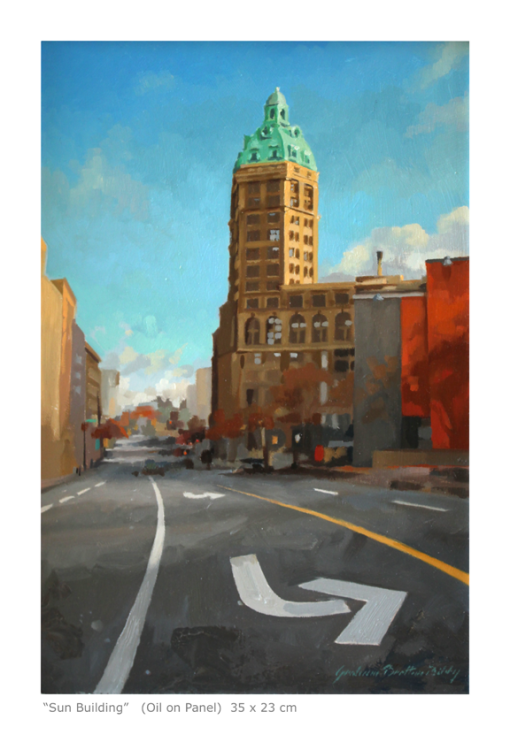
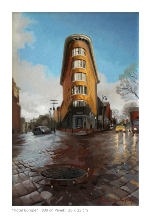
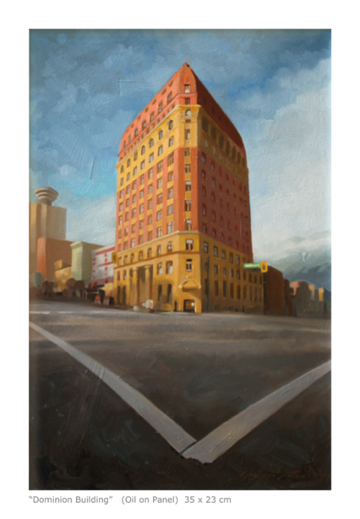
Coming back to Vancouver after a long absence I was attracted to some of the oldest buildings in the city. It just seemed right to put them all together.

vancouver_cityscape_triptych_smThe “Sun Tower” was originally called “The World Building”. It was, like so many of the historical buildings in Vancouver, the tallest building in the British Empire after it eclipsed the Dominion Building in 1912.

I keyed the whole painting so I could get the green copper-oxide green to *sing* in the mid-morning light. (It was only recently that I found out that the dome it is actually made of steel and is just painted to look like copper.) Still, the dome works well and the contrast of the minimalistic road markings echoes the “L” shape of the building. There are nine terracotta caryatids that were far too detailed and busy to be included in such a small painting. I will have to include them, and more of the building’s details, when I make a larger version of the subject.

sun_buildingThe Hotel Europe is an iconic building for the Gastown district. It was the first in that locale to be built of steel, brick and reinforced concrete so, as planned, was fireproof and outlasted its neighbors.

It is often sunny and wet here, especially in the fall and spring.

hotel_europeThe Dominion Building is massive. I think the painting conveys that fact. I did enjoy the variety of *shapes* the inhabitants had made with the window coverings. It broke up the monotony of the facade. Grand Empirical columns are contrasted by a fanciful row of robotic faces in the upper stories. There is a wonderful potential for more contrast with the haze covered mountains in the background.

dominion_building


Diptych

4 11 2014

bridges_diptych_sm

A couple of paintings designed to hang together, side by side.

I’m enjoying my new home away from home and the challenges of different vistas and all too familiar weather patterns. Still, the West Coast weather, almost identical to that of Paris, does provide some dramatic sunrises and sunsets.

These small sketches are painted from almost the same vantage point on Granville Island on False Creek. The painting on the left is of the older, Burrard Bridge at sunset…

burrard_crossing

…and the Granville Street Bridge, at sunrise, is on the right.

granville_island_landing

On a technical note the paintings are also in two different chords: Blue/Orange on the left and Yellow/Purple on the right.


My New Business Card

24 04 2013

I have been getting some interesting reactions to my new business card so I thought I would share it with everyone.

artistic licence license frontHere is the back of the card:

artistic licence license back

I can now present this to anyone who sees me working and says something like “The tree isn’t really over there.”

It saves a great deal of explanation and I enjoy giving everyone, not only my students, artistic licence.

For my American friends there is no spelling error in “Licence”. It’s the way it is spelt, or spelled, in other English speaking countries. Don’t worry, I will make an application for an American Artistic License soon.