UPDATE Oct. 5, 2015: See this post for updates to the GIS files described below, including the new Hudson Yards subway station and 7 line extension.
As promised, I’ve created an updated GIS data set of subway routes in New York based on MTA’s latest GTFS data, which I’ve posted below for anyone to use. (I’ve also converted the latest MTA GTFS data to GIS format for NYC Transit bus routes, following up on my earlier post this spring.) Scroll to the end of this post for the links.
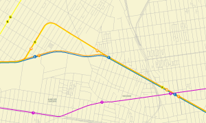
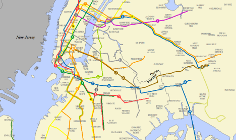
I hope my effort provides a template for creating a map layer for apps and/or printed maps that approximates the line symbology on MTA’s map, but improves on this map in several ways — the GIS version is spatially precise, scalable, and may even look better than what Google uses for its transit layer in New York City. The images below show the map zoomed out and zoomed in, and the post below explains how I did it.
Going forward, hopefully the MTA itself will provide subway route GIS data in the format I’ve described below (or something similar) alongside the GTFS data. Any feedback or suggestions for improvement will be much appreciated.
Context
After reviewing the GTFS data files in detail, it became clear that GTFS is not necessarily applicable for displaying transit lines on a map and/or analyzing the spatial patterns with GIS. At least that seems a fair characterization regarding the GTFS version of the city’s subway system.
Even though the GTFS files include a “shapes.txt” file for subways (the spec says this is for “drawing lines on a map to represent a transit organization’s routes“), this is only helpful for basic line representations. This seems to work fine for bus routes. But for subways, either the GTFS structure or MTA’s implementation of it poses challenges for creating a map layer of subway lines.
New York’s subway system includes local and express routes that are composed of inbound and outbound trips along the same line, some of which may start or end at different stations. And there are “skip-stop” trains and “trunk” lines (where multiple routes run on the same set of tracks, such as the E, F, M, and R in Queens from Jackson Heights to Forest Hills). But the GTFS “shapes” data from MTA only provide a partial representation of this complexity.
To attach route IDs to the “shapes” file, shapes.txt needs to be linked with trips.txt based on shape_id. But doing so causes the 1, G, and latest version of the M line to drop out, because the trips.txt file does not include any trip entries for these routes. Also, for some reason, it results in the inclusion of lines that aren’t used anymore (at least for passenger trips, as far as I know).
This is just an early iteration of MTA publishing its GTFS data, so I’m not surprised these limitations exist. Until these issues are fixed, we have to rely on workarounds. For example, the MTA has provided a separate shapefile for the 1 and the G (see earlier discussions at the MTA Developer Resources listserv). According to MTA,
We [MTA] do not have shape data for these lines because of changes in their station configurations have occurred since we lost the staff member who had created the data. We have not had funding to replace him and update the data from 2008. We can provide the data next week with a hand-done solution, and/or better data at some later time, when we are able to acquire the staffing to do so.
This undermines the idea of using GTFS as a “feed” (as its name implies) for automatically displaying subway lines on a map, but hopefully the process will be more seamless as the issues are worked out.
But the  and
and  lines are not really missing from the GTFS data. The GTFS “shapes” file on its own (without filtering it based on the “trips” file) includes line segments for virtually the entire subway system. It’s just a question of being creative with combining the trip_id and shape_id fields from the trips.txt file to extract the appropriate geometry for the routes in question. For example, the correct G shape is certainly there; it’s denoted by the “G..N05R” or “G..S05R” shape IDs. It just so happens that there are no records in the trips.txt file with these shape_id values. But it’s easy enough to create a new “route” field in the shapes file and populate it with a combination of values from the “routes.txt” file and manual entries for the lines that don’t seem to exist (such as the 1 and G).
Other issues with the shapes.txt file after filtering with the trips.txt file are that the  line terminates at 57th Street/7th Avenue and the GTFS data includes shapes that show the
  running to Jamaica-179th St, the
  running to New Lots Ave on the 3/4 line, the
  extending to New Lots, and the
  running to New Lots. As far as I can tell, these routes do not exist for the riding public. Perhaps these are artifacts of older routing schemes, but it makes for an inadequate solution for mapping. I’m curious how the automated routing and scheduling apps deal with this.
——————————–
UPDATE 7/20/10
After I wrote the preceding paragraph, I did quite a bit more digging into the subway GTFS data for a post at my blog about subway stations. I realized that my points above about the ![]() and
and ![]()
![]()
![]() lines were wrong. There are, in fact, stops that these trains make at the stations I mention above. There aren’t many of them, but they exist. My post about station data explains this more fully. So for these routes at least, the shapes.txt file is ok.
lines were wrong. There are, in fact, stops that these trains make at the stations I mention above. There aren’t many of them, but they exist. My post about station data explains this more fully. So for these routes at least, the shapes.txt file is ok.
——————————–
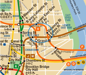
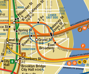
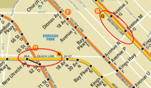
A bigger problem, though, is that the latest version of the  line is missing from the shapes data, and can’t be created from the approach described above for the 1 and G. The images below highlight the challenge – the area in question is circled in blue on both images. In the old map, the M runs along what is now the J-Z line, and the orange F-V and B-D lines cross the J-M-Z line. Unfortunately this old routing is what the latest GTFS geometry follows.
But with the latest service changes, the new M line comes in from Brooklyn and then goes north to meet the B-D line. In the latest shapes.txt file, there is no such geometry for the M. The geometry follows the old J-M-Z line with no obvious shape that follows the M’s new northward jog to meet the B-D line.
Therefore, I created a new line segment for the M, combining segments from the old M and V lines (shape_id values of “M..N89R” and “V..N01R”), along with an arc connecting the two, using ESRI’s ArcGIS editing tools.
Methodology
Once I had the updated set of “shapes” from GTFS, my goal was to somehow convert this data into a GIS version of the MTA’s subway lines in a way that could be replicated (and perhaps integrated back into GTFS format) and also easily symbolized to show separate lines along trunk routes.
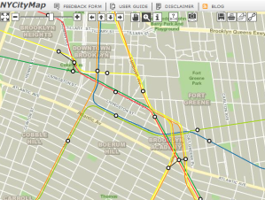
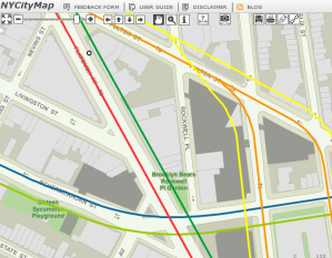
As far as I know, to the extent anyone had a GIS dataset of subway routes prior to GTFS (such as this one we had created for the OASIS website by digitizing the MTA’s subway map), the only way to display separate trunk lines was to manually edit the geometry of the GIS line segments along a trunk route by clipping the line and moving it parallel to the trunk line, so it would show up as a distinct line symbol. Obviously this has problems — the manual work involved is tedious, imprecise, hard to replicate, and it doesn’t scale well — it might work at a certain zoom level, but then zooming in would show the parallel lines farther apart and zooming out would show them merged together — as illustrated by the images below from the NYC Citymap website, going from a wide zoom to a closer zoom:
(The Citymap site is just one example; you can see a similar situation on OASISnyc.net — as you zoom in on the map at this link, you’ll see the  and
and  lines become farther apart.)
Divisions and Lines
I remembered that NYC Transit uses “division” and “line” designations that might be helpful in distinguishing the segments. The divisions are a throwback to when the subway system was really three separate systems — the IRT, IND, and BMT. But the line designations are based on more or less current track arrangements (and you can see some of these on the current subway map – see excerpt below).
For example, the movie “The Taking of Pelham One Two Three” refers to the  train running on the Pelham Line, leaving the Pelham Bay Park station at 1:23. Wikipedia has lots of information about the line designations, such as the IND 6th Avenue line or the BMT Nassau Street line.
But how to assign these to the shapes.txt file? The line IDs/names are not included as part of GTFS, and I’ve not seen this information provided anywhere else (publicly anyway).
Station entrance/exit data provides the missing link
Then on July 1 the MTA released a file listing subway entrances and exits with latitude/longitude for each one (the file was updated July 7 to fix some issues in the earlier data). Useful in its own right, the file includes the station name for each entrance/exit along with its division and line. Neat! The entrance/exit points don’t necessarily overlap or intersect the line shapes, so I wouldn’t be able to automatically assign the divisions and lines to the shapes using GIS, but there are only 37 unique lines based on the entrance/exit data so it wouldn’t be that hard or time-consuming to do it manually.
My approach was to create a thematic map of the entrances color-coded by line designation, overlay the GTFS shapes file of subway routes, and then edit the shapes file by splitting the segments where each set of color-coded entrances ended and adding the corresponding line attribute to these new segments. The image below illustrates the approach.
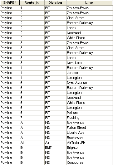
In other words, instead of a single shape representing the ![]() line, I created six non-overlapping segments to represent the entire 2 train route (along the 7th Ave-Bway, Clark Street, Eastern Parkway, Lenox, Nostrand, and White Plains lines). I used the ArcGIS “Split Tool” quite a bit, and ended up with a shapefile with 80 unique shapes (including the AirTrain — which is included in GTFS but isn’t managed by MTA so likely doesn’t have an MTA “line” designation). The attributes from the new file look like this:
line, I created six non-overlapping segments to represent the entire 2 train route (along the 7th Ave-Bway, Clark Street, Eastern Parkway, Lenox, Nostrand, and White Plains lines). I used the ArcGIS “Split Tool” quite a bit, and ended up with a shapefile with 80 unique shapes (including the AirTrain — which is included in GTFS but isn’t managed by MTA so likely doesn’t have an MTA “line” designation). The attributes from the new file look like this:
This was a manual process based on visual inspection of the line segments, so I’m sure error has crept in. Also, the way I did it, I allowed for some exceptions. I didn’t rigorously create new segments, for example, along what appears to be a trunk line in Manhattan where the IND 6th Avenue and 8th Avenue lines meet at the West 4th Street station. And I probably didn’t handle lines travelling over bridges or through tunnels as well as I could have. And the 5 route along the IRT White Plains line extends from Nereid Avenue to 138th Street/Grand Concourse, but the #5 in the Bronx that just runs during rush hour goes from East 180th Street to Nereid Ave (so on my map the dashed line symbology extends too far south).
Overall, though, I think it works well — it’s pretty good for a first pass.
ArcGIS caused import hassles …
Btw, I should point out that though ArcGIS’s editing tools were great for splitting and re-combining the line segments, ArcGIS misinterpreted important fields when importing the GTFS text files. Fields that were text (such as “route_id” in the trips.txt file) were imported as numeric, preventing an accurate join. I needed to use another program (I used SPSS) to save the trips.txt file as a DBF which preserved the text format of the field. (I had tried using Excel to convert from TXT to CSV and also to XLS, but that also forced the text field to convert to numeric.)
… but ArcGIS provided invaluable cartography tools
Next step was to create the symbology. I relied on two ArcGIS features to display multiple lines along a trunk route as discrete line symbols: the “cartographic line symbol” feature, and “symbol levels”. The cartographic line symbol component of ArcGIS’s Symbol Property Editor, among other things, enables you to attach an offset value to the line symbol. See screen shot below. The great thing here is that the offset is relative depending on the zoom level of the map — as you zoom in or out the line symbols do not merge together or move further apart, thereby solving the problem parallel copies of line segments.
The Cartographic Line Symbol tool also allows you to create a dashed line symbol, which I used for the Rockaway Park Shuttle and the rush hour extension of the 5 train in the Bronx.
The “symbol levels” feature enabled me to ensure that line segments weren’t inadvertently masked by others along the same geometry. For example, simply offsetting the  and
and  routes from the
  and
and  routes running along the IND 8th Avenue line may result in two parallel orange lines, rather than a blue and an orange line. Setting a priority symbol level ensures that the blue and orange lines will run in parallel.
The resulting trunk line symbology looks good whether you’re zoomed out …
… or zoomed in close:
Soon we’ll have the updated lines and symbology on the OASIS mapping site.
In order to recreate the map symbology, I’ve preserved the color scheme in an ESRI layer (.lyr) file, linked below along with the actual shapefile. If you’re using a GIS that doesn’t use layer files you’ll need to redo the symbology, but at least you can use the attributes to do so.
(The layer file includes subway route labels that were inspired by an approach provided by ESRI’s New York City office that we first applied for the OASIS site — using the subway route icons a la the MTA subway map. I’ve streamlined it a bit here, and it’s easy to modify further either with ArcGIS or another GIS package. I’ve included a basic MXD file that preserves the labeling. The MXD uses ESRI’s Maplex labeling engine, but the labels will work with ESRI’s standard labeling engine as well.)
The one missing component to this data is a layer of transfers between subway stations. I know this has been discussed on the MTA Developers Resource list, but this will have to wait till a more robust data set is available (or I or others have the time to put one together).
Links to the data
Here’s the GIS subway data in shapefile format (zipped):
- Shapefile
- Layer file for symbology
- MXD for labels
If you use the data and layer file (which I hope you do), please let me know how it works out. I’m not including any kind of Creative Commons licensing, but I’d appreciate it if you could reference the “CUNY Mapping Service at the Center for Urban Research” if you use the data and especially the layer symbology in any printed maps or online applications. Thanks!
Also, here are the post-June 27 service change bus routes in shapefile format (zipped):
- the “grouped” version (214 distinct features, one for each bus route); and
- the “triphead” version (includes duplicate line features, for a total of 978 features, because buses on a given route may be travelling to different end points).
Better than Google Maps cartography?
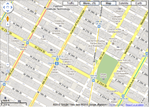
I definitely wanted to compare my GIS version of the subway GTFS data with Google Maps, which presumably uses the GTFS data not only for transit directions but also for the basemap itself. Two things surprised me. One was that, as of today (July 7) almost two weeks after the MTA’s service changes took effect, Google Maps still shows old subway routes and station information.
The map below, for example, still displays the old  line (see the 23rd St/6th Avenue station) and the discontinued
  line (see the 23rd St and 28th St Broadway line stations).
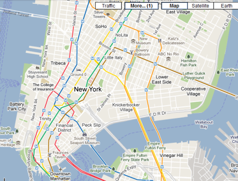
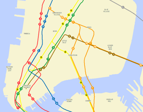
Also, the subway lines on Google Maps were choppy and not as smooth as the GTFS-derived GIS lines. The images below compare the two in lower Manhattan.
I don’t think it’s nitpicking to point out the difference. One important aspect of the MTA’s GTFS data from a cartographic perspective is the high-quality route geometry. It makes it that much more useful not only for good map development, but also for spatial analysis and alignment with other NYC GIS data layers. Kudos to MTA for providing it. I’m surprised Google apparently doesn’t use GTFS for their basemap (hopefully they’ll correct me if I’m wrong).
Going forward
For my purposes (and I think I’m far from alone here), I’m more interested in displaying the subway lines in a map layout than developing an application that provides routing and scheduling. Whether or not I use the data for spatial analysis, I’d like to have a subway layer for use in a GIS or any other application that needs the symbology of MTA’s printed map but is more spatially precise than MTA’s map and not as fine-grained as individual trips.
The GTFS format is great for all the web and mobile applications that are being developed. But for the purposes of local planning work by Community Boards, students, the media, public officials, etc — we want to see the subway lines on a map and analyze them spatially — visualizing and understanding the relationships of nearby land uses, demographics, etc as well as the ability to monitor maintenance and operations trends, determine who represents each line when service changes are being proposed, and more. So hopefully MTA will see fit to provide subway route data in a systematic way so we can integrate it easily into our maps.
It’s likely that NYC Transit maintains its subway line/route data in a similar structure as I’ve described above in GIS format, either for planning/modeling purposes or for other mapping needs. Ideally it’s in a format that allows for an automated, rules-driven way of displaying the routes by division/line so changes are handled as seamlessly as possible. In other words, it would be great if MTA could provide the subway data in a way that doesn’t require the additional staff resources that are involved in coverting the scheduling/routing data to GTFS format. I’m not expecting anything as simple as “just hitting the export button,” but hopefully something close :). And since subway routing doesn’t change very often (certainly not as frequently as schedules), this should be much less of a burden on the agency than the work involved in providing the GTFS data.
I look forward to continuing the dialog.
Filed under: Cartography, Data | Tagged: Cartography, Data, Transit |






Nice work! I’m sure many people (including myself) would be interested in buying posters of these.
Once again, Steve has our thanks.
Of course, we support his point that transit data ought be made available in an industry standard format.
Thanks agaain, Steve.
Ira
Great contribution Steve. So great this data is now available publicly.
Are the seas changing in NYC? 🙂
Ray,
Thanks for the note, great to hear from you. Data access in NYC has indeed been undergoing a sea change lately (though there’s still much more to be done!).
Hope the UC goes well this year. Sounds like lots of good stuff will be announced. Sorry I’ll be missing it.
Thank you Steve! The application of this new GIS will certainly bring a greater deal of sophistication to many businesses. Without sounding greedy, I would like to know if you plan to or already include turnstile count data for the various stations.
Thanks Chris. Two things about stations and turnstile data. One is that I’ll be uploading a GIS version of the MTA’s GTFS “stops” file shortly that will have route IDs attached to it. The GTFS structure facilitates the display of route IDs by station on the client side, as it were, rather than integrated into the data file. But this doesn’t help in terms of displaying the route IDs, say, as part of station label on a printed map (or even as a tiled layer in a web application). So I’ve poked around to find some code to create a concatenated string of route IDs for each station, so it can be added easily to station label on a map.
The other thing is that I don’t plan to integrate the turnstile data, but perhaps someone else can help with this. We don’t have a need at the moment to add turnstile data to the stations list (though this certainly would be interesting in terms of analyzing the patterns station by station). At the same time, unfortunately the turnstile data provided by MTA doesn’t include the “stop_id” values from the GTFS stops.txt file. The turnstile data includes a station name, but the name values are different from the name values in the stops file, so linking the turnstile attributes to stops isn’t easy (or will at least require some manual work upfront). Hopefully MTA will rectify this going forward.
Thank you Steve! This is so helpful. And I second your hope that the MTA will coordinate their turnstile data with their stops file.
I think the MTA uses Caliper’s TransCAD as their GIS which allows auto offsetting – it is not perfect, but it is better than nothing. So in TransCAD a line will be offset only where the route is shared and you do not need to split the segments at all.
I think ESRI needs to include a similar feature. In the mean time I am trying to figure out how to do it using representations which is more than you should have to do for something this simple.
Have you figured out a way to incorporate the stop times of trains into GIS?
Great job, by the way!
This is great, especially for subways.
One problem though – correct me if I’m wrong, but I think you excluded most local Queens bus routes.
Keep up the good and very useful work!
Thanks Matthew. The Queens bus routes were excluded because they’re provided by MTA in a different format than the other GTFS files. The comment from Tim Calabrese is the same, and my reply directs him to the discussion at the MTA Developer Resources group.
[…] MTA data in GIS format Posted on July 20, 2010 by Steven Romalewski My previous post was on subway routes; this time I tackle subway stations. (Apologies for another long […]
Hi Steven,
I have intentions to use your shapefiles in my analysis and maps. Usually, I give credit to agencies/people that create the shapefiles I use. I would like to know the proper attribution of your data for my maps. Thanks for the hard work.
Thanks for your note. Glad you like the work, and that you’ll be able to use the data. Regarding attribution, the underlying data is from the MTA; they may attribution requirements at their website. As far as the enhancements I added, if you could use the following attribution I’d greatly appreciate it: “CUNY Mapping Service at the City University of NY Graduate Center.”
[…] integrated the latest subway and bus data that I’ve blogged about earlier (here and here), and also added bike routes via the NYC Dept of Transportation (one of the latest city […]
[…] (including me — I feel like I’ve been on a tear lately, blogging about data sets with great potential but that need lots of work before they’re […]
Can you explain how you used ArcGIS to create polylines from the shapes.txt file?
Thanks for the question. Short answer is I used ET GeoWizards. I provide a fuller explanation in an earlier post. Scroll down to “My Methodology” where I talk about methodology for creating route lines. In my case I used the ET GeoWizards extension for ArcGIS, but you can probably find an open source alternative (Hawth’s Tools might provide something similar). Or, if you have the full version of ArcGIS, I believe there’s a “feature to polyline” item in ArcToolbox. Hope that helps.
[…] MTA wrangled by Steve Romalewski: mta-data-in-gis-format mta-gis-data-update […]
Thanks Steve,
Working on a LU study now that calculates distance to transit. Shame NYC does not make it available, I have spend half my time tracking down data…
J.P.
Hi, any idea how to map which segments of the subway are elevated? I want to highlight and even measure which portions are elevated. Thanks for all your work!
Thanks for your comment. That’s a good question. I don’t if there are any explicit, publicly available data sets that indicate which subway route segments are elevated. But I have a couple of ideas:
– you should post your question (if you haven’t already) at the MTA Developer Resources Google Group (http://groups.google.com/group/mtadeveloperresources). Other developers may know about such a data set, and MTA staff regularly follow the group’s questions and posts so you may get a response directly from the agency.
– the city’s GIS division (DoITT) had a data set representing elevated transportation structures. I haven’t looked at this in a while, but it may provide some hints at which of these structures coincide with subway routes. Feel free to email me directly and I’ll see if I have a copy.
– the city’s LION file (the street centerline GIS file from City Planning) includes attributes that represent relative elevation. If you compare the street segments spatially with subway routes, this may also give some indication which routes are elevated or not.
Thanks a bunch for the effort you put into this. I ended up using your files to draw some of the maps I used in these blog posts about re-scaling NYC based on MTA transit time:
http://datagardenblog.net/2012/01/30/nyc-time-map/
http://datagardenblog.net/2012/03/3/nyc-time-map-2/
Thanks Zack, glad the files were helpful. And thanks for the links to your work, I’ll take a closer look.
[…] come across several examples of people being able to use the MTA subway and bus data that I had converted to GIS format a couple of years ago. I know that I’ve been able to put the data to good use. But […]
[…] created this map using Open Street Map data of NYC and a NYC subway shapefile I found. The inspiration for the map came from the people who created Kick Map, […]
[…] tracts within 1/4 mile of all subway lines by median income (I used a 2010 .shp file created by Steven Romalewski at the CUNY Mapping Services at the Center for Urban Research) to see whether there is a […]
Hey there Steve…is there any way to get lon/lat data for the stations on the MTA developer’s fare data site? I don’t see any location attributes there, only remote codes. I can’t tell if I’m looking at 168th in the bronx or in Queens. And when two lines have the same stop. i’m trying to create a template that I can join to the fare data every week based on the remote codes, but i gotta be certain about what remote codes are going to what station! Also, the last time I checked this data was up to date. Now it only goes to April 2011! Do you know what is going on?
Thanks for this great resource. We are using it to help our partners get volunteers between their hotels and the various Disaster Recovery Centers for Hurricane Sandy.