
In the previous post, we talked about how emails have changed over a period of time and become more responsive. It defines how the emails have transitioned from desktop to mobile for various email clients and different screen sizes. It is important that we see examples and learn what is happening in this space. So, here I dive again into my inbox to pull out some real world examples and see how email layouts differ from desktop to mobile.
Example #1: Pinterest
Desktop Version

Mobile Version

Things to note while comparing the desktop layout vs mobile layout-
- Text layout becomes skinnier to fit the mobile screen.
Example #2 – Apple
Desktop Version

Mobile Version
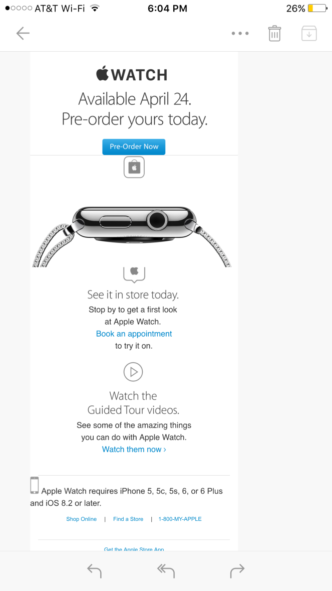
Things to note while comparing the desktop layout vs mobile layout-
- Text layout becomes skinnier to fit the mobile screen.
- The three call-to-actions have taken a vertical layout in the mobile version.
- The “Get the AppleStore App” headline is hidden in the mobile version.
Example #3 – AT&T
Desktop Version

Mobile Version

Things to note while comparing the desktop layout vs mobile layout-
- Text layout becomes skinnier to fit the mobile screen.
- The tabular borders are hidden in the mobile version.
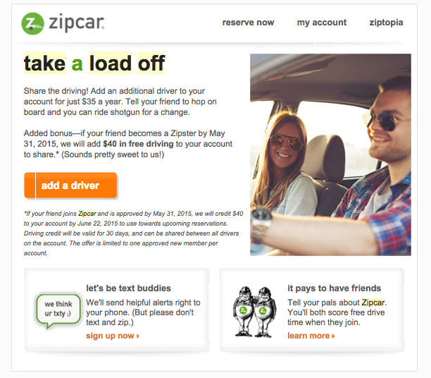
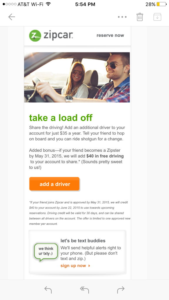
Example #4 – Zipcar
Desktop Version
Mobile Version
Things to note while comparing the desktop layout vs mobile layout-
- Header is shorter in the mobile version. The navigation has reduced.
- The hero image comes on the top in the mobile version whereas it’s on the right hand side in the desktop version.
- The hero image has been resized.
- “It pays to have friends” invitation action has been hidden in the mobile version.
- “add a driver” button has become bigger in the mobile layout.
- Text layout becomes skinnier to fit the mobile screen.
These are just a few real examples of responsive email designs [Tweet this]. These are just some of the ideas on designing responsive email layouts and of course, there are more. I will look for more examples and upload them so that we can have another look at the different tactics that people are using.
 MarketEng