This is the third part of an ongoing series regarding EPUB formatting, geared toward the adventurous indie author who would like to format their own books.
Last week I was finding that my drop cap scheme wasn’t working as well as I would have liked. If you happened to miss them, here are Part 1 and Part 2 for your convenience.
This week, however, I’ve had a couple of developments, which, to me, are pretty exciting. First of all, I have heard that Amazon will be improving their Kindle experience for readers, both owners of Kindles and those who have the Kindle app on their phones or tablets. They will be using a new, specially created serif font that will be much easier to read. Another development will be additional support for better justification of paragraphs, and finally better support for drop caps. By the end of the summer, these new changes will have been installed on all Kindles and integrated in the Kindle apps. With some ebook prices as high as $14.99, one would expect a bit better formatting for the money.
As you might expect, this is great news for anyone who takes formatting their own ebooks seriously. This means that all our efforts will not be wasted because of Kindle’s inability to get a drop cap straight.
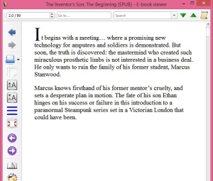
That all being said, here are a couple of examples of the progress I’ve made since last week:

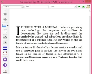
And now, a look at the difference this week…

This is the page I’m most excited about (so far):

See the difference CSS makes?

And look at this trick: the image adjusts to the size of the screen, so it won’t get cut off, even if someone is reading my book on a phone…

Here’s a tip: it seems that the EPUB comes out better when converted to an EPUB with Calibre, and then sent to the Kindle Previewer.

When I get some screen shots of my EPUBS actually on the tablet, using either Kobo reader, Nook reader, Google Play books, or all three, I’ll be posting them, probably by next week.
I’m reformatting The Inventor’s Son now, and as you can imagine, this is a longer job. It’s also calling for more CSS tricks, and I can get a couple of screen shots of them next week too. By then, I might have some block quote text done, (which got completely lost in the upload to Google Play originally).


Pingback: Geeking Out With Sigil And EPUB Creation, Part 4 | S B James, Doing the Write Thing
Pingback: Geeking OUt With Sigil And EPUB Creation, Part 5 | S B James, Doing the Write Thing