Twice Fashion by Socio Design
Opinion by Richard Baird Posted 14 October 2015

Twice Fashion is a Chinese luxury accessory brand established by Tina Tian and Dr Mirko Wormuth in 2007. Since then it has grown to become one of the country’s top accessory brands, with stores in Beijing, Tianjing and Chongqing. Twice Fashion is described by SocioDesign, the London based graphic design studio behind its rebrand, as having helped shaped China’s ‘fast’ fashion industry.
With the intention of building on their success in mainland China, while also setting the stage for a move into the international market, Twice Fashion worked with SocioDesign to develop a new visual identity treatment. This included logo, logotype, packaging, bags and business card design, with consideration given to the brand’s existing visual language, reworking it where necessary, and its global aspirations.
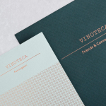
Based around the themes of “special moments” and “feminine confidence”, SocioDesign developed a simple but thoughtful logo that references the dual nature of the name with two intersecting lines drawn with the elegance and craft associated with Chinese calligraphy. This is paired with a colour palette that, individually, feels current but collectively has the capacity to be long-serving and distinctive, rather than associated with seasonality or trends. This is helped by the cool concrete greys which bring an urban edge to the femininity of a salmon pink.


The logotype shares the calligraphic qualities of the logo, a pairing that favours continuity rather than further duality, and again subtly touches upon the brand’s Chinese origins. This is well-drawn and proportioned, a little loose with its spacing around the I but has some nice lettershapes. The typographical ornament of Plantin, the secondary choice, grounds sans-serif modernity, the contemporary and slightly avant-garde layouts of the stationery and the colour palette with a sense of heritage and experience.

Heavy dyed boards, solid packaging structures with draws and ribbons, tissue paper and stickers, colour contrast, black block foil print finish, plenty of uninterrupted space, and the prominence of the logo, play up to and leverage details, finishes, shapes and layouts associated with high-quality, and fall quite comfortably and intentionally within the conventions of the luxury fashion market, specifically those of Europe, whilst remaining distinctive and identifiable.
Unfortunately, the website, handled in-house and not by SocioDesign, falls a little short, and in English, struggles to really craft the cohesive and compelling brand story or online shopping experience you would expect to accompany and give weight to a polished visual identity treatment, and a modern luxury fashion brand.
Design: Socio Design Fonts Used: Plantin. Opinion: Richard Baird.