June’s Top 5 Projects 2013
Opinion by Richard Baird Posted 1 July 2013

Willow Tree, describe as London’s leading business consultancy, recently commissioned design agency Bunch to develop a new but traditional looking visual identity with an attention to detail evident throughout their stationery. Based around a WT monogram, created by typographer Spencer Charles, and executed as a mix of embosses, carved in seals and simulated watermarks – achieved with an oil-based ink – across purple cloth, black leather, cream paper and handmade coffee pottery, the solution embraces a crafted sensibility alongside a more contemporary use of space and type.
Read the review here.

Yoosli is a new online service that enables customers to create their own muesli mix from a choice of over 65 ingredients delivered as a one-off or subscription service to their work or home address. UK-based studio Together Design – commissioned to develop Yoosli’s brand identity and e-commerce website – created a cast of what they describe as eccentric characters, “each of whom represents a different personality and muesli flavour”, alongside a conversational speech-bubble device to convey the ‘joyful’, personalised and ‘creative mixing experience’ provided by the service.
Read the review here.


Popchips is a four flavour range of potato chips from Ping which have been popped – much like popcorn – rather than backed or fried to create a healthier snack. New Zealand-based Marx Design were responsible for developing a new mascot for Ping that could work across multiple products in the snack food category and a packaging solution for the Popchips brand that would “avoid the clichés of traditional chip packaging in order to achieve cut-through.”
Read the review here.

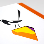
Fika is a bar and kitchen located on London’s Brick Lane with a rustic menu prepared on site and to order, all of which can be taken away. Created by Designers Anonymous, Fika’s visual identity, which extends on-line, in-print and as signage, is an illustrative and photographic mix of characters, cartoons and quirky compounded imagery bound by a consistent logo, material choice and a recurring perforated edge detail.
Read the review here.

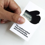
Designers Anonymous is London-based multidisciplinary design agency with global clients from a variety of sectors. The agency has appeared on BP&O on a number of occasions, with highlights including their packaging work for Zest and Patchett’s, and their identity work for Fuller’s hospitality brands The Parcel Yard, The Tokenhouse and Brewer St.
Following the launch of their new website this week, Designers Anonymous has published images of their new visual identity system. Based around large symbols and sans-serif type, plenty of space and a neat print finish, this new identity communicates, in an unusually efficient but also playful manner, the goals of the agency.
Read the review here.