
In debating the values of data visualization maps, I’ve gone both ways. The value of maps as specific arguments–and tools of spatial orientation–respond to the value of the selective criteria that cartographers foreground in them, after all. Less inventive differentiations of spatial distributions “flatten” the map’s surface, and limit their value to the map-reader. Their arguments are not as interesting, one might say.
The early visualization of this elegant choropleth map employed data from the Census of 1860 it translated into visual form to map the density slave population across the recently seceded Southern states. Long touted as an important strategic tool, the rhetoric of an isolated mapping of the Southern states framed debates about the Civil War with greater subtlety than current tiresome choropleth maps of “red” vs. “blue states.” The 1861 lithograph marked the density of slave-owning in pockets by darkening sites of the greatest slave population, perhaps to mask the ownership of slaves throughout the South and point to the defenders of a slave-based economy.
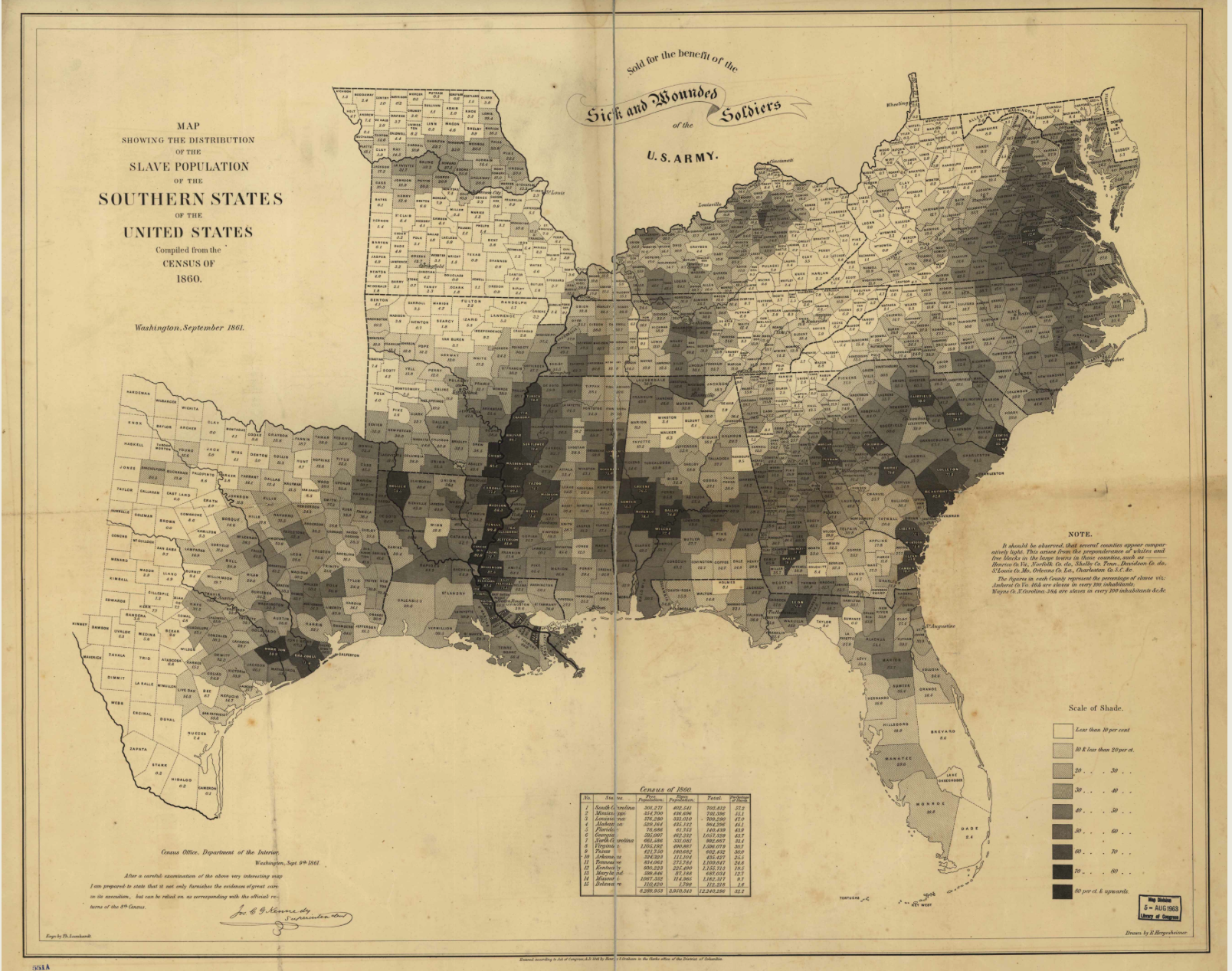
If the census provided a basis for Edwin Hergesheimer and Alexander Dallas Bache to create the map, a collaborative government effort as much as an independent enterprise of the commercial engraver Henry S. Graham, the use of statistical cartography prefigured the mapping of social or political trend in the field of human geography. While the recent German immigrant Hergesheimer created the pro-Union map from figures in the Census after his work on the US Coastal Survey, the translation of the results of the Census into visual form proceeded because the Coast Survey’s Superintendent.
Although a deeply collective project, Bache’s recent success in assembling a team to map the coastal survey gave him a new public profile, and prominence, to back the project of mapping a visual record of data assembled about slavery in Southern States. The map tellingly reveals Hergesheimer’s deep Liberal opposition to slavery as an institution and the pro-Union belief of supervisors of the eighth national census, but its visual explanation of the origins of secession intentionally focussed attention around slavery debates. Printed in September of 1861 after hostilities had begun, and ten states had seceded from the Union, it isolated the evil of slavery in the seceded region, and highlighted the centers of slavery’s institution even before slavery became the central issue of the war.
Hergesheimer and Bache were instrumental, too, in adopting the most current techniques of mapping to portray the differentials of slave-owning in the Confederate States just before the South’s Secession. The half-tone engraving he designed to show slave-holding states in the “Southern States of the United States in 1860” foregrounds discontinuities in the national territory by using figures he derived from that year’s national census. Known as a “Slave Density Map,” the lithograph exemplifies cutting edge statistical mapping and an artistic use of half-tones to depict the seats of the evils of slavery in seceded regions of the United States in a piece of pro-Union propaganda: slavery existed throughout the Southern states, but was concentrated “down river” in Mississippi, Georgia, South Carolina and Texas. The lithograph provided something of a moral map of the region beyond which Lincoln sought to forbid the expansion of the slave-economy. Printed and sold by the government in wartime ostensibly for the benefit of Union Soldiers, the single-sheet map used half-tones to differentiate relative variations each county’s relative density of slave-holding across the Southern states. But although the map presents itself as an appeal for wounded veterans of a war in which soldiers were so dramatically injured, its mapmaker aimed not only to raise funds through direct sales but broadly encourage the war effort by illustrating slavery as literally darkening the nation.
With considerable cartographical sophistication in charting variable densities of slave-ownership, the map illustrated striking discontinuities in the nation and even suggested divisions in the Confederacy at the outset of the war:

Bache was a deeply moralistic man, as well as a former Lieutenant in the Army who, after graduating from West Point until 1829 designed coastal fortifications before he rose to head the Smithsonian. Bache had won national eminence as the head of the United States Coastal Survey, using a team of trained surveyors, several university observatories, and many field assistants to triangulate the coastlines from a base-line near Annapolis. Based on readings from numerous sighting stations, the map extended west to California and endured through the twentieth century. After mapping the shorelines of the United States, Bache devoted himself to mapping its islands of slavery.
Most maps made in wartime are valuable strategic tools to orient troops, as much as map vulnerabilities. But this map was not made for a lack of cartographical records. (It did not meet a desire for cartographical knowledge, for example, as the many paper maps shipped to Kuwait during the 1990 Gulf War–often incorrectly considered the first war fought by GPS–as 67 highly detailed topographic line maps of the region, some bathymetric, at the incredible scale of 1:50,000. Incredibly, the Army lacked accurate maps of Kuwait, and these were quickly prepared during the war based on remotely sensed satellite images.) Bache’s map had far less apparent strategic use, identifying pockets where a slave-based economy was particularly dense, and all but ignoring physical topography or population centers. But the map was compelling as an image of the divided nation. Bache and Hergesheimer designed the map for a civilian populace, using the 1860 census to create a visually compelling distribution that revealed regional disparities in “slave-ownership” and the population identified as slaves to reduce the scope of the confederate secession.
The map provides an image of the nation taking stock of itself, or learning to look at its divisions–a rare thing. Bache and Hergeshemier’s map of this nexus of the Southern economy was ostensibly sold to raise funds for “Sick and Wounded Soldiers of the US Army,” or veterans, as gothic script in scrollwork crisply notes. It’s been argued that the map identified possible pockets of resistance, or possible seats of opposition to Union forces. Lincoln consulted the map after the war, to consider ways to encourage the Southern economy. But the elegant map roots the struggle of the Civil War in disparities of slave-ownership in the South, to question the fierceness of opposition to the Union, or to show the enemy and stakes in the war. By starkly differentiating each county’s degree of reliance on slavery by shades of grey, it offered viewers a stark map of racism in parts of the region–if it also perhaps perpetuated racism unwittingly in directing attention to the suffering of soldiers who could benefit from its sale and not sufferings inflicted by the economic institution of slavery.

But the map also made its point of isolating slave-ownership in select regions of the Southern states, in ways that masked the continuity of slavery across the region. The remove of the Southern states from the North, and isolation of precise regions where the practice of slavery was most extreme, echoed Bache’s belief in the political uses of science by applied cartography to national needs and for the public good.
It is interesting that Hergesheimer’s design for the map followed Bache’s success in precisely mapping the nation’s shorelines as Superintendent of the Coastal Survey. The project established Bache’s credibility in large-scale surveying. The new survey not only used the survey of coastal lines to map the interior, but may have provided Hergesheimer and Bache to turn attention to the occupants of the land as the US Government desired at that point. The actual survey of coastal lines offered a sort of template to construct the map of slave-holding populations by using nine shades of half-tones to darken regions in differing degrees that created a compelling image of the fractured nation, and minimized the widespread nature of the social acceptance of slavery in seceding states. The detail of the shore and coastal islands throughout suggests that the US provided not only contour lines for the map, but a template for national coherence–the unstated if implicit subject of the Slave-Holding map, and a central preoccupation of the wartime government.
The map of slave-holders adapted census information to the basic contours of states to map aggregate variations of slave-owning in states. Although the map is given the strategic value of predicting resistance to the Union troops, it was probably most valuable for its inspirational or hortatory appeal as much as its accuracy. Bache tried to expand the public functions of cartography in the map by adapting recent statistical methods to compellingly map two different worlds within the same nation. A career military man and scientist, Bache was a public servant committed to the public utility and good of surveying and meteorology–a counter-part to Matthew Fontaine Maury, the polymath oceanographer and cartographer who served in the Confederate Navy 1861-5 and was Bache’s long-time nemesis: Maury, whose cartographical interests I discussed in an earlier post, and who had himself hatched the ill-fated scheme for slave-owners to resettle from southern states to Brazil’s Amazon Valley in the early 1850s. Bache’s map is both a detailed picture of social divisions and an image of a divided nation. If this unlikely project was impractical, Bache’s map focussed on the seats of the slave-economy in seceding Southern states.
Susan Schulten noted in 2010, in a blog post to which I’m indebted, that Bache’s map shows a striking concentration ownership of slaves on the shores of the Mississippi, where cotton crops dominated, Alabama and the low-lands near South Carolina (which enslaved the majority of its population) and eastern Virginia; she suggested that this snapshot of slave-holding had strategic value to determine sources of greatest resistance in the Confederacy as well as for Lincoln to consider future economic development of the South. The map must have constituted something like a “news map” for readers eager to understand the actual numbers of slave-owners in the deeper south, and the relative degree to which slave-owning had continued to endure in the Republic. Parts of the broadsheet provided a strikingly compelling illustration of the locations of slave-ownership and an economy of slavery where Cotton was still King, as much as the Southern states as a whole:

Slavery was widespread in both Charleston, South Carolina, and Savannah:
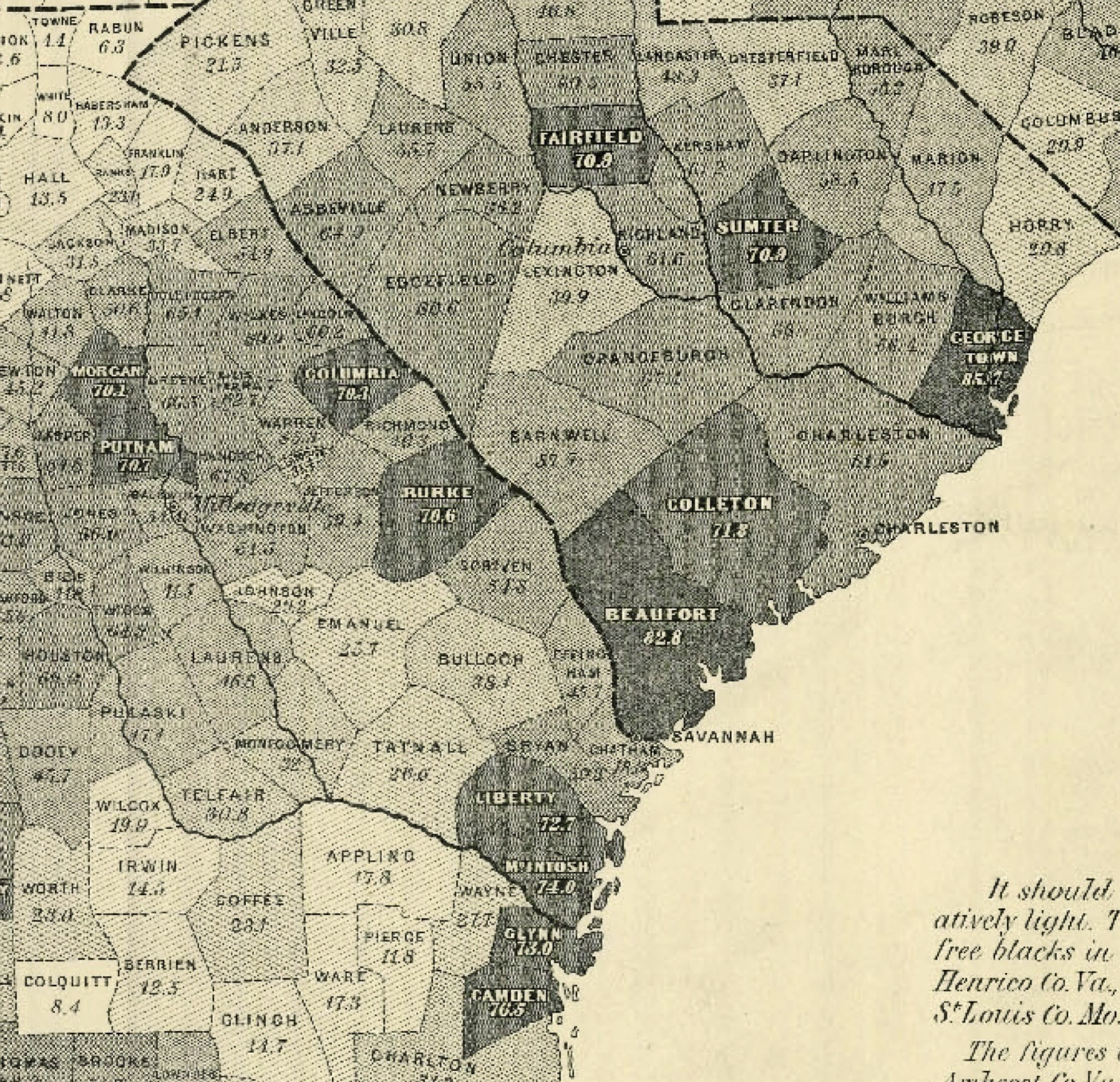
And, similarly, a pointed reliance on slavery around the area of Galveston, Texas:

But there are multiple ways to read the project for designing the map. The image of slave-holding lands provided a victory map for the Union soldiers, who sold it to raise money for their fellow-veterans who remained sick or injured, as if to stake the agenda for a need of remapping the nation, echoing a Jeffersonian idea of the use of surveying as a foundation for democracy. It was the map by which Lincoln used to follow Union troops as they liberated slave populations, or understand the seats of rebellion, but had huge power in graphically stigmatizing Southern states. It was also an idealistic statement of the goal of ending slavery in the war effort.
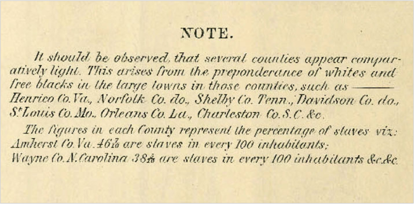
This striking legend that explained the iconography of the map’s nine variations in shading, placing the greatest “free blacks” in large towns:
The innovative exercise in terrestrial cartography was also the last attempt to quantify slave-holding in the nineteenth-century, although it integrated public records that were later widely accessible.
It was, sadly, also the final time the Federal Government revisited the topography of slave-holding with similar precision. The failure to remap the same distribution seems one of the more stunning cartographical silences of the twentieth century. Bache’s impetus to draft the map might be informed by his long involvement in public education and belief in the public utility of the sciences; he effectively lent a polemic character to conventions of statistical mapping by exploiting the different gradations of shading available to the engraver to craft a useful piece of early printed cartographical propaganda.
Indeed, its use as a piece of propaganda in wartime may have outstripped its potential as guide to military strategy. Lincoln regularly studied the map, according to his portraitist Francis Bicknell Carpenter, who found the president studying the map with considerable intensity in 1864, during the six months when he lived in the White House to paint the portrait “President Lincoln Reading the Emancipation Proclamation to His Cabinet.” But his inclusion in the image of the choropleth map that accentuated national divisions reflected his interest in illustrating Lincoln’s “statesmanship” and “solid integrity” in bridging the nation. By his own account, Lincoln had taken great pains to explain to Carpenter both the origins of “his adoption of the Emancipation policy” and his decision to draft the Proclamation from late July 1862, before he put it aside until being sure of military victory. “I resolved,” Carpenter wrote in his memoirs, “to represent the scene [of Lincoln reading the Proclamation to his Cabinet] without the appliances and tricks of picture-making, and endeavor, as faithfully as possible, to represent the scene exactly as it transpired; room, furniture, and accessories all were to be painted from the actualities.” Did the room actually include the map of slaves still ‘owned’ in the South?

Carpenter’s state portrait depicting Lincoln reading the Proclamation to his Cabinet placed the lithograph in a small but a prominent role that most observers would not fail to notice. As if to illustrate the subject of the recently issued Proclamation, if not the thoughts that weighed on the conscience of the President, the map emerged from behind a chair at the painting’s base. Lincoln loved the portrait. The map is the essential subject of his discourse; Carpenter made good use of it to capture the stakes of the Proclamation. The nine bars of graduated shading in the map stand out among printed books in the group portrait, reminding viewers, both recording a moment of triumphalism and presidential dignity, and suggesting the uphill battle for implementing the Proclamation in the deepest South. The map speaks volumes:
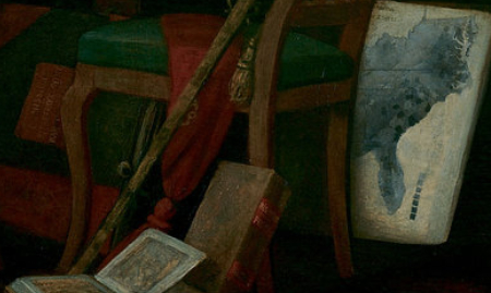
It reminds us not only of Lincoln’s hope to transcend social divisions. Before Carpenter included it to illustrate the grand subject of Lincoln’s address–and Steven Spielberg also used the map in “Lincoln,” behind Daniel Day Lewis’ shoulder–the 1861 lithograph provided a tool to imagine political coherence in a more perfect union, urging men to enlist and others to get behind the war.


I would love to see the whole of the Carpenter portrait, of whch I take it you’ve posted a detail–and to know more about Lincoln’s relation to this map–did he really plot troop movements on it?–and about mapping slavery since Bache: are you saying that no one else did it after him?
Pingback: Choropleth Map of Slavery Extent 1861 by State by County « Flexible Reality