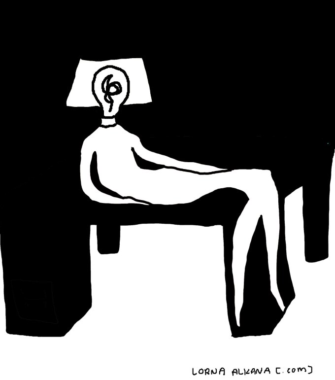
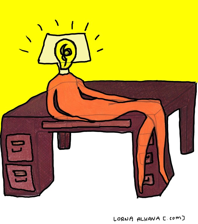
My proximity to my desk directly correlates with how much I can accomplish. (<– maybe that should be the image’s text.) This is an image I changed to black and white. I like how this version looks more finished than the initial pen and colored pencil drawing (below). What do you think?
I didn’t add text to this image because everything I thought of seemed forced and too concise to be honest or meaningful. I figured the lines of the drawing can “speak for themselves” (and then I sat a while and pondered such an expression and whether or not I could find another way to put it).


First, thanks for visiting (and following) my humble blog. I like your style of drawing very much, it looks so free. And can I just say that the “People in Household Items” series is brilliant. I sympathise with the Refrigerator one very much because I live in a hot climate…
I agree – the b/w drawing is better – makes the mind fill the gaps. I also think of quirky ideas like your own and I don’t worry about the quality of the drawing. I’m hoping to start putting my ideas on a seperate blog from my more ‘serious’ artwork. Keep up the drawings Lorna
Both are great, but black and white is the winner in my book!
Cool! Thank you for the feedback!
Thank you for the feedback! I see what you mean. Break a leg with your art blog!
I prefer the simplicity of the black and white one – love how there is no details in the desk, but one can still tell what it is and I think without desk drawers the focus is much more on the human-lamp (no distractions)
Cool! Thank you for such a thoughtful response!
I prefer the black and white, but then I’m a sucker for b&w, so there you go. I love the way that everything just melds together in the b&w; no distinction between desk and wall/ceiling. lovely!
mmm, I also get a neat illusion of height with the b&w, like the desk just keeps going up…. kind of creepy, but in a good way (a sort of Neil Gaiman way, if you know what I mean)